Thursday, 27 August 2020

Three More Three by Four


Here are three more of these "guardians" compilations. Bringing them together like this, I am aware of how far indulging my taste for the grotesque may be unsettling for some. Indeed, it's hard to imagine quite who would want to put a set of pictures like those four above on a wall within their living space. Even I find them a little disturbing.


OTOH, someone must be buying the considerably more grotesque output of the Chapman Brothers, not to mention the work of twins Doug and Mike Starn. Maybe I should invent a brother for myself, or even better, an identical twin? I wouldn't be the first: consider the case of the wonderful Beggarstaff Brothers, or the singular Bob and Roberta Smith. However, given the difficulties banks are now putting in the path of those of us with variant names – even things as mild as "Mike" versus "Michael", or the habitual use of a middle name – it seems less like a good idea. It's hard to imagine how "Bob and Roberta Smith" ever manages to bank his receipts, given his real name is Patrick Brill... Maybe he doesn't sell very much. Maybe that's why.


Sunday, 23 August 2020

Three by Four


Largely confined to quarters by the weather, and being in a synthesising frame of mind, I thought I'd see whether I could do something interesting with my series of "guardians" pictures. Looking at them, I could see there were some nice little groups of four that would fit conveniently into some cheap 60cm x 30cm panoramic frames I had bought for some other, forgotten project and which have been sitting around unused in a corner for some time. I think these do actually work rather well together.


However, although I put them together quite quickly, the quantity of original work distilled into these grouped images is much denser than it might appear, superficially: I'd estimate that at least two solid weeks of photoshoppery will have gone into each group of four, not counting the original labour and expenses that went into finding and photographing the raw materials. Let me see... At an hourly rate of, say, £30 [1], I make that around £2,500 each that I ought to recover, one way or another, just to recoup my notional labour costs. Not forgetting the £9.50 each for the classy frames, of course... Ah, well. It's an entirely theoretical calculation, of course, based on self-motivated work nobody had asked me to do, and rather like working out how much you're owed for mowing the lawn, or doing the washing up. Sure, if I were to offer them for sale I'd have to put a realistic price on them but, in the end, the only thing that matters is that they represent time well spent.


1. Artists' Union England hourly rate for someone with 5+ years of experience is £33.83.


Wednesday, 19 August 2020

Special Edition 2


The nice thing about having a completed photo project to play around with is that you can concentrate on the setting, rather than the content. In many ways, this is more fun, and it's certainly a satisfying way to pass a series of gloomy, rainy days such as we've been having this week. Certain commenters on the Let's Get Lost book (eminent, self-regarding types, in the main, who AFAIK don't read this blog) implied – if fairly discreetly, to the point of deniability – that I was rather better at book-design than at originating photographic material, which may well be a fair comment, even if it has cost them a free copy.

The nice thing about a fantasy book is that it can have different-sized pages for portrait and landscape oriented photographs, which is always a major book-design headache, and one which can only really be overcome by using square pages, or disguised by playing around with the size and placing of the images, which – if done well – can have design benefits, by varying the "rhythm" of the book, and so on. It usually isn't done well, though: for example, I have yet to see a conventionally bound book where splashing pictures across the central "gutter" works to the benefit of the content. Yes, it looked great laid out flat on the screen in InDesign, but is pretty annoying as a 3-D object in the hand.


Friday, 14 August 2020

Special Edition


While we were in Bristol we paid our customary visit to the Oxfam Bookshop in Clifton, masked-up like freelance book-surgeons, and spent an enjoyable half-hour browsing and deciding what not to buy. I was struck by the presence of some unusually desirable photo-books, most of which I already have – phew! – but also by a surprising number of Folio Society editions, which always intrigue me when they turn up in charity shops, given how expensive they are. Someone's shelves had clearly been given a radical clear-out.

If you don't know their productions, the Folio Society is a book club, specialising in luxury or "crafted" editions of classic books, ancient and modern, which is to say large, illustrated, slip-cased, highly decorative books, with good printing on the best paper, the sort of thing that lines the bookshelves of a certain sort of reader. Not mine, though, I should say. Although some are quite beautiful, most are just rather OTT or, to be honest, even slightly naff to the true bibliophile. I mean, much as I have enjoyed reading Lee Child's Jack Reacher books – highly recommended to anyone who has ever fantasised about being eight-foot tall and an invincible dispenser of rough justice in an unfair world – why would I or anyone want a cloth-bound, illustrated edition of Killing Floor, costing £50? It would be like having a jewel-encrusted bus-pass holder.

However, it did make me wonder what my own recent production Let's Get Lost would look like in a "sumptuous", no-expense-spared version. So I decided to mock up some page-spreads for myself – nothing too fancy, naturally – and I must admit I was quite pleased with the results, especially when presented as if "float-mounted" onto a larger sheet of rough-textured paper. I think they'd look pretty fine sympathetically framed on a wall, and are in a way more pleasing to the eye and certainly more practical than they would be contained within the covers of some actual, over-sized, over-produced book. As one astute commenter on the Folio Society's website put it, when reviewing their edition of A Pilgrim's Progress (illustrated by William Blake, and a mere £295): "A beautifully produced book which would look good on the shelf, but too heavy and unwieldy to actually read".


Monday, 10 August 2020

Instagram

 Here's a question for you: do you use Instagram? If the answer is yes, and particularly if you are a photographer or artist, what do you use it for? Has it brought you any benefits, beyond attracting the occasional "like" or "nice pic!" comment? I'd be interested to hear.

I ask because people have sometimes asked me, "Are you on Instagram?", but, now that I have finally got around to looking into it, it seems like an essentially ephemeral platform. Crucially, it is also entirely phone-based. I was amazed to discover that, officially, you can only upload image files to it from your phone. True, it can be gamed by using 3rd-party apps or by exploiting various cunning back-door ways in, but in spirit it's a phone-only app. Worse, it can't be downloaded in its current incarnation onto my antique iPhone 4s.

Why have I finally got around to looking at something that others have been using for years, and which is probably already past its peak? Well, clearly, I put a lot of work into this blog, and have recently updated my website, but the audience for all this effort – both visual and written – remains very small: I'd estimate that I have around fifty regular readers, a number which has remained constant for years now. It doesn't do to get grandiose about the size of readership one might expect to accumulate, but I hope you'd agree that this is good stuff that deserves an audience in three figures, at least! I suspect part of the problem is that I lack a presence in the social media world – for whatever reason [1], it seems none of my blog posts ever gets linked to Twitter or Facebook, which is not something I can have any influence over – so I'm in a Muhammad-mountain situation.

So I would be willing to duplicate some of the effort that goes into this blog on another platform like Instagram to attract a bigger audience, but only if that audience was likely to do more than glimpse at a phone-sized image, click a "like" button, and move on. Who needs that kind of attention? Which probably means, who needs Instagram?

1. TBH I expect that my fifty loyal readers are rather like me, and have no presence on either Twitter or Facebook.


Thursday, 6 August 2020

Arboretum


I thought the "Stand" cut-out looked a bit too boringly regular, so I merged it with elements from its close relative, Arboretum, in the hope of making something a bit more pleasing to the eye. I think this does work better. It wouldn't make such a good cut-out book, probably, but it's easy to forget that's not really the point. This was something that I was reminded of when, on impulse, I ordered a "print behind vinyl glass" of the original version from an excellent German-based printing setup called Whitewall, partly because they were having a sale (who isn't at the moment? It's vulture time... Hang in there, guys!), and partly because I just wanted to see if it really would work, presented that way. It's a handsome thing, no doubt, but – as a 40cm square slab of shiny vinyl – the intentional irony of its cut-outness takes a closer examination to be evident. First and foremost, it's a picture to mount on the wall.


We're having a change of scenery at our Bristol flat this week, which is always good, but particularly welcome after nearly six months at home, or skulking around the streets and supermarkets of just one suburb of Southampton. It's always quite a dramatic change, as the flat is in a block that stands on one side of the Avon Gorge, with an uninterrupted view across to the other, heavily wooded side. Even knowing that the busy A369 road lies just over the tree-lined horizon, you can easily imagine the view as virgin territory, inhabited by wolves and bears, as the uncrossable tidal river rises and falls twice a day in its long cradle of muddy rock, and the buzzards circle overhead. For some reason, this week I became fascinated by the clouds that pass along behind the trees, and began leaning out of the window to grab shots of them. With a bit more care, there's a nice panorama that could be constructed of the entire horizon. Maybe tomorrow.

Sunday, 2 August 2020

Let's Get Completely Lost


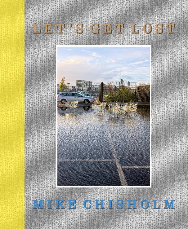
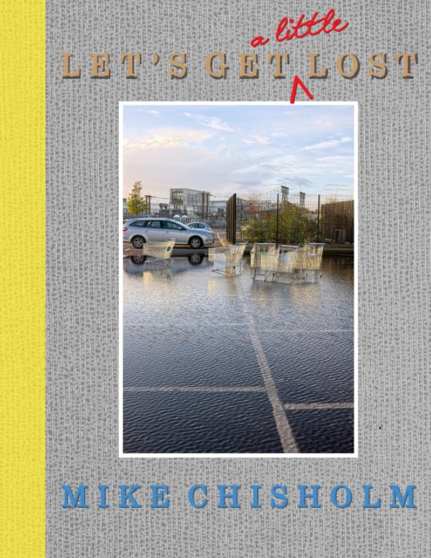
Back in June I reported that I was finally getting somewhere with what had started out as a "postcards" project, loosely based on Luigi Ghirri's book Kodachrome, under the title Let's Get Lost [1]. In the meantime I've sent out copies of a PDF of the first draft for comments, which have been both useful and encouraging, and have been revising both the content and, for want of a better word, the container. Even at a reduced 116 pages it's still quite large, and not cheap as an on-demand Blurb book. I have been looking into the possibilities of "proper" self-publication with a trusted printer/publisher (Kozu), but I'm very cautious about that: the price per copy would work out much cheaper but, even as a short-run production, a couple of boxes of unsold copies under the bed would represent a serious financial investment in dust-bunnies. I'd probably end up giving them away.

As far as a Blurb book is concerned, I think I've now taken this as far as I want to, and so have made it available in two forms:
Above is the full thing, an 8" x 10" book of 116 pages, available in paperback (£39.99) or in hardback (£49.99). I know: Ouch! Of course, there's always the full PDF at £6.99, but no-one ever seems to buy those, which is a mystery to me: you get the full thing, dirt cheap, in a universally "portable" format, with the images in their original state, un-muddied by printing onto paper [2].

Below is the condensed version, Let's Get (a little) Lost. It's in Blurb's "magazine" format, which is slightly larger ("American letter size", i.e. 8.5" x 11"), but edited ruthlessly down to a mere 64 pages (£14.99). I think it still works perfectly well as a book sequence, although I see no point in making it available as a PDF, when it would be the same price as the full 116 pages.


I must admit I'm dithering about the possibility of self-publication. Back before on-demand publishers like Lulu and Blurb appeared on the scene, I did set up and register my own publishing brand, Shepherd's Crown, and bought a batch of ISBNs linked to it, some of which still remain unused. But I quickly learned the dust-bunny lesson, referred to above. You can publish it, but they will not come. At all. In fact, it's quite striking how long even a well-reviewed, commercially-published, signed and numbered limited-edition photo-book can remain available, even to the point of being offered at a substantial discount by booksellers several years on. It's a very "niche" business. Nice as it would be to have fuller control over the final product than is possible via Blurb's book-making tools – and above all to bring the price down – what would be the point, if no-one will buy the thing anyway? So-called "vanity publishing" is a notoriously doomed enterprise, but to be one's own vanity publisher is not so much vanity as insanity.

Blurb's business model is, in the end, a clever one: satisfy your urge to make several books a year, without the drain on your finances or, ultimately, the need to buy a bigger house. There is, after all, an enormous difference between buying one book for yourself at £25 or even £50, which is available for sale in a personal online "bookstore" managed by Blurb, and buying 100 copies of pretty much the same thing at £7.50 each, which you then have to market and distribute yourself, when you are highly unlikely to sell copies into double figures of either. Although it has to be said that their increasingly frequent "40% off" sales would suggest it's also a business model that is not quite delivering, for them, as expected. Hang in there, Blurb!

1. The title of a song indelibly associated with West Coast jazz trumpeter Chet Baker, to the extent it is also the title of a recent biopic. Pretty much the only thing we have in common is having our front teeth knocked out, clearly more of a problem in his case than mine.
2. It would help, I think, if Blurb embedded the optimal viewing settings in Acrobat (I have proposed this to them), which are:
Under the menu "View" select "Page Display", and choose both of "Two Page View" and "Show Cover Page in Two Page View". Personally, I also like to choose "show gaps between pages", and to reduce the size of the book in the viewing window by one click, but those are more a matter of taste.

Tuesday, 28 July 2020

Sad


For a decade or so bridging the 1980s and 90s, until we had children and I went part-time, I was a member of the Executive Committee of the local branch of the academic trade union, then known as the AUT, at Southampton University. Those were difficult years for the trade union movement, and also for higher education: at times it felt as if we were at war with the zeitgeist, and as a result there was a high level of commitment and camaraderie among the activist members of our union. It was the same everywhere: when I attended national-level meetings as a representative of the so-called "academic-related staff" (librarians, administrators, and so on) the sense of embattlement was very real. Both government and the top management of many universities were clearly out to change things radically, but as we thought – rightly – in a bad way and for the worst possible reasons. So I was taken aback to discover recently that one of my old comrades from those days, a particularly effective President and Secretary, is now Sir Ian, ex-Vice Chancellor of Aberdeen University, and the National Statistician, no less.

There's no law against a poacher turning gamekeeper, of course, but the desire and pursuit of eminence is a curious hobby, and quite alien to most of us. Certainly, I was brought up in a family where the simple morality of working-class Baptism could be boiled down to: be nice; don't show off; be suspicious of hierarchies and self-proclaimed authorities; trust that everything and everyone has a purpose, but that it's not up to you to decide what that is. When it came to worldly aspirations, to become a teacher was about as far as anyone could see. At school I was quickly recognised as one of the brighter kids, but my teachers were good people of limited horizons, whose expectations and moral foundations were much the same as those at home. Nobody ever whispered in my ear, "One day, my lad, you could be Sir Michael, Lord Stevenage, ruler of the world!" Which was probably a very good thing. I have never wanted to be the boss of anything, or felt that my abilities, such as they are, entitled or obliged me to make any such claim.

Desire and pursuit are not necessarily linked, and it suits the purposes of those who would rule us to separate the two. It's widely acknowledged that one of the main motivating engines of our society is the constant stimulation of a free-floating desire, which is only ever temporarily satiated by material consumption. As a result, there are an awful lot of people who feel they want something quite badly, but have little or no idea what it might be. The idea of fame has substituted itself as a sort of consumer-lite version of genuine achievement. It seems many children, asked what they want to do with their lives, answer, "I want to be famous!", as if fame were a job description. Which, to an extent, I suppose, it has become.

In old age, this inchoate desire seems to transmute into a nagging sense that one might have done more with one's life. Which is almost always true. I expect even David Attenborough sometimes regrets the years he wasted making those TV programmes, when he could have finished his postgraduate degree at LSE and gone on to do some serious academic work. I'm no more immune to this than anyone else, so there I was the other day, reading an article in the TLS which considered the steep decline and fall of most boxing careers [1], when a quote from Matthew Arnold, of all people, delivered a stinging left jab. It was this:
It is a sad thing to see a man who has been frittered away piecemeal by petty distractions, and who has never done his best. But it is still sadder to see a man who has done his best, who has reached his utmost limits – and finds his work a failure, and himself far less than he had imagined himself.
Now, I'm happy to put my hand up to a certain measure of under-achievement – I'm a lazy man, with a tendency to daydream, and an instinctive aversion to self-promotion – but this has never struck me as sad. It's who I am: I was never going to be anybody else. No, Arnold is transparently talking about himself: he is the poet laureate of anyone who had natural abilities that somehow failed to thrive, particularly if starved by deliberate neglect. Auden's sonnet on Arnold asserts, memorably: "He thrust his gift in prison till it died". He did give poetry a good go when young, and published what would in time prove to be some of the most enduring literature of the 19th century. However, his efforts came in for some snarky contemporary criticism and so, given that he doubted his own true capacities in that regard anyway, he gave it all up for a proper job. A trajectory that will be familiar to many, and which, again, does not strike me as remotely "sad". The world has a far greater need for school inspectors (Arnold's choice of career) than for poets.

Matthew Arnold and I have history, I should point out. He – or rather his poetry – featured heavily in my school sixth form English studies. I was introduced to his glum Victorian worldview at that sensitive age when your view of what poetry is all about – and indeed what life is all about – is being formed by the diet put in front of you. Seventeen-year-olds should only be exposed to the sophisticated but dubious pleasures of despair and self-repression, Arnold-style, with a certain caution, I think. Arnold's poetry, like that of so many Victorian poets, exudes existential sadness like a contagion. A too-early acquaintance with the pleasing melancholy of middle-aged regret can warp our expectations of life's outcomes, by pre-preparing us for disappointment and failure [2]. A not entirely unrealistic forecast, of course, but why get the Bad News so early in life? Arnold is best-known for a single poem, the anthology standard "Dover Beach", a sonorous groan of despair at the decline of the age of religious faith. It is without doubt a very good poem but, once you have discovered that in all probability it re-enacts a solemn but histrionic monologue delivered to his wife in a Dover hotel room on their honeymoon, it becomes irrevocably hilarious. As well as conflicted and sad, two rather more characteristic Arnoldian emotions.

Our criteria for success and failure are set very early on in life, I think. I've written before how a friend and I had been unprepared by our family backgrounds or education to grasp the nature of the opportunity that had been put in our path by being admitted to an Oxford college (also Arnold's college, as it happens) that has long acted as the launch-pad for eminent lives. For us, a solid public-service career in education or the Civil Service with a final-salary, index-linked pension scheme was the ultimate goal, Plan A, not a fallback position: it would represent a major step up in our family stories. Yes, we might have entertained fantasies about alternative lives as writers or musicians or artists, but failure – an almost certain outcome, in retrospect – would have been catastrophic, and to have taken that risk would have been the sort of folly only the exceptionally brave (or irredeemably strange) can contemplate: working-class families have no safety nets to cushion the fall of their crash-and-burn casualties. So success was measured by securing that job and doing it as well as possible, sustained over the course of thirty-plus years, with a bit of writing, music, and art on the side. A very ordinary and possibly underpowered set of ambitions, perhaps, but the bar seemed high enough, and it was gratifying to have cleared it comfortably and in fine style.

True, I came nowhere near being the person I fantasised I might become in my teenage moonage daydream years. But who does? I'd bet even Tony Blair still poses in front of the mirror with his Fender. Which must be a sad spectacle, indeed, in the more contemporary sense of the word. But what if those other, bolder, riskier choices had paid off? What if, instead of crashing and burning as a writer or artist, I had soared, reached escape velocity, and left the ordinary life of a "civilian" far behind? Well, I imagine that – in the very unlikely event that those bolder, riskier choices had paid off – it would have felt pretty good. I imagine that it would have seemed like the just reward for being a truly special person, a golden exception to the general rule; justified, even, in a quasi-religious sense. Dangerous stuff. But I also wonder if, looking back, it would have felt good enough to compensate for the trail of wreckage and hurt that seems to accompany the self-centredness of prominent creative lives? I'm also pretty sure that even to wonder about that is to understand why one was never in the running in the first place.

More mundanely, there was always the route of the dedicated careerist, of course, seeking serial promotions into the most elevated senior ranks of the professions, where the honours come up with the rations, as my dad would have said. But, just as Groucho Marx didn't want to join any club that would have him as a member, I had no desire to lead any organisation that would have had me as its boss. Besides, I never once dreamed about living that sort of sober-sided, grey-suited lifestyle, learning to conduct a committee like a string ensemble, or how to compose the definitive position paper. Again, what sort of person does? "Sad" doesn't begin to cover it.

Of course, I did have the unfair advantage that no-one had ever whispered in my ear, "One day, my lad, you could be Sir Michael, Lord Stevenage, ruler of the world!" But is that really how extreme ambition arises in otherwise normal-seeming folk? I wouldn't know, obviously. Do some schools run special extreme-level careers-advice sessions? Or perhaps it's genetically pre-programmed into alpha types? Do some more modest people get talked into it by their exceedingly ambitious partners, à la Macbeth? Or maybe they get blackmailed by shadowy "black ops" agents, seeking to corrupt the workings of the state from within? Who knows? Perhaps, if we ever meet again, I should ask my old AUT comrade when and how it all started to go so horribly wrong for him, after such a promising start in the awkward squad. After all, nobody ends up as a university vice-chancellor or taking a knee in front of Her Madge by accident, do they? It seems a fair enough question to ask, on a par with, "So why on earth did you decide to get your face tattooed?" But I expect he wouldn't even remember who I am by now, after chairing so many committee meetings and drafting so many position papers, and might even have me escorted from the building by security. Now that would be sad.


1. TLS July 10 2020: "In the hurt business: The rise and fall of ‘The Fighting Jew’", By Declan Ryan.
2. Whether the close reading of gloomy poetry at an impressionable age might actually induce self-doubt and inner conflict or merely exacerbates pre-existing tendencies it's impossible to say, but I suppose, in this ultra-cautious age, someone somewhere might feel inclined to run a proper randomised, double-blind case-study to determine the truth of the matter: "Can Victorian poetry destroy a child's life-chances?". Meanwhile, a precautionary ban on the teaching of Tennyson is surely the only wise course of action.

Thursday, 23 July 2020

Recycled


Accordion-folds are not the only style of book susceptible to a mock-DIY approach, of course. My original interest in these alternative formats was sparked by a visit to an exhibition of Buddhist texts at the British Library back in January, and prominent among these were many examples of the palm-leaf book, in which long narrow "pages" (originally made from processed palm-leaves, but subsequently from other materials shaped to the same format) are strung together like a slatted blind.

So here is a first attempt at a DIY, card-engineered palm-leaf book. If I have another go, I may make more of an effort at some proper 3-D modelling: each "page" could be a six-sided flat box, for example (this is where the lessons learned from my packaging deconstruction hobby will come in handy). But I like the visual impression it gives, anyway; it has a certain Zen presence.

Talking of which, and given you can barely see the detail at this scale (the original is 50cm square) and would have enormous difficulty cutting your screen up to assemble it correctly – no, please don't try – I can reveal that a haiku by Kobayashi Issa (1763-1828) is hidden in there:

On the morning frost
The blacksmith's sparks
splashing

For no reason, really, other than that one of the raw materials was this previous four-bar construct:


Which, in turn, made use of one of the many circular haiku texts I created for the exhibition "The Colour of the Water" (2003) and the subsequent book Downward Skies:


As with the cardboard boxes, I like to recycle stuff, even if it is only made of pixels.

Sunday, 19 July 2020

Cut It Out


I've been having some fun in the past week. My original idea of the "poster book" has taken a DIY turn, and become the "cut and construct" booklet. I have always been a fan of those card models where an entire three-dimensional Houses of Parliament or Peregrine Falcon has been reverse-engineered into a sheet or two of card printed with shapes to cut out, score, bend, and glue, complete with guidelines and assembly instructions. By comparison, a cut-out accordion-book is a pretty simple challenge.

In fact, what I like most of all is the way the pristine, flat sheet of card looks before it has been imperfectly butchered with scissors and turned into yet another dust-magnet around the house. So these DIY booklets have been set out as if they were intended to be realised as card-engineering projects, but are actually meant to remain intact as 2-D pictures. I have created them as 60cm square images – six so far – but (in the unlikely event that anyone were ever to select one of them for an exhibition) I would probably reduce them to 50cm or even 40cm and present them in that very contemporary-looking, frameless, "dibond and acrylic glass sandwich" style. I think they'd look great.

Another aspect of card-engineering that intrigues me is the construction of packets and boxes, particularly the lighter-gauge sort used for tea, biscuits, and other grocery items. Ever since recycling was introduced I have taken to carefully disassembling such packaging, rather than simply stomping it flat, as I have become fascinated by the sheer variety of solutions to what you might think was a fairly simple, standard packaging problem: make a six-sided box using a single die-cut piece of card that is rigid enough to withstand handling and transport, yet easy enough to open, and if necessary act as storage for the contents. Some of the designs are as simple as you would expect, but others are bafflingly baroque: any Brits reading this might want to try deconstructing a range of teabag boxes into their original complete flat sheet sometime. Points will be deducted for tearing any card: the PG Tips box is a particularly intriguing challenge.


Wednesday, 15 July 2020

Bath-Time Extremity


Diana: selfie with Actaeon

Well, after you've turned someone into a stag for stumbling across your bath-time, and then had him torn to pieces by his own pack of hounds, you're going to want to show off your handiwork, aren't you? Heh, what am I like? Gorgeous, that's what! And maybe a little savage. Check it out, immortals!

I'm pretty sure the swivel-eyed Roman below is not Ovid, but he's got the look, hasn't he? "The poet's eye, in fine frenzy rolling" and all that.
They hem him in on everie side, and in the shape of Stagge,
With greedie teeth and griping pawes their Lord in peeces dragge.
So fierce was cruell Phoebes wrath, it could not be alayde,
Till of his fault by bitter death the raunsome he had payde.
Much muttring was upon this fact. Some thought there was extended
A great deale more extremitie than neded. Some commended
Dianas doing : saying that it was but worthely
For safegarde of hir womanhod.

Ovid, Metamorphoses, Book 3 (trans. Arthur Golding, 1567)

Ars Poetica

Saturday, 11 July 2020

Waiting


I do love a backlit bus-shelter. I'd hoped to keep a bit more detail in the highlighted area, but only other photographers notice or care about that sort of thing. In the end, it's the overall effect that counts. 

In fact, now I come to think of it, I really like all those transitional places – bus-shelters, bus-stops, railway platforms, cafés, and so on – where we are open to the in-between moments when one thing has paused and another has yet to start, and certain realities are foregrounded that normally lie hidden in the busy background. Waiting around can be a sort of enforced meditative interlude: the poem "Adlestrop" by Edward Thomas captures the feeling exactly.

These don't need to be actual places, of course: there are times in life like that, too, ranging from passing idle moments of "wool-gathering" – I'm a past master at staring out of the window – to longer periods, such as the weeks between ending one job and beginning another. As one who has spent a working lifetime within the rhythms of the academic year, I immediately think of those summer weeks between the end of exams and the receipt of results, and then the release into a month or two of leisured irresponsibility for the lucky few, or a first taste of employment (or, more likely these days, unemployment) for the rest.

Just now, quite a few spaces are waiting for us: where'd everybody go? Sadly, the Nuffield Theatre (which, if you know what you're looking for, can be seen reflected in the view of a backlit university café below) will be remaining empty for some time: the Covid shutdown has driven it into "administration". Although this happened so very quickly – by the end of April – that you have to wonder whether opening a second venue in the city centre was such a good idea after all. But it's a shame to see forward-looking optimism punished quite so brutally.


Wednesday, 8 July 2020

Reformation


Genuine imitation Bonnard: £65

[Portentous voice]: Previously on Idiotic Hat:
I suppose a major factor in my liking for multiples is that, like so many of us from small-town backgrounds, I acquired my tastes in art from books, posters, magazines and colour supplements, and never saw many actual examples of the "real thing" until my late teens. The real thing, it turned out, was often disappointingly crude, compared to a good reproduction. Of course, the imperfections that might, to you or me, seem like "crudeness" in a painting – the layered corrections and brushstrokes, the reliance on easy but expressive effects, the poor finishing, and all those qualities that announce "made by hand" – are the very things that are admired by those who put a high value (aesthetic and monetary) on the uniqueness of a work of art. Some people, after all, like to drink their coffee from some bulbous, warty, stoneware mug bought from an artisan's stall, whereas I prefer the smooth, functional perfection of industrially-produced china.
I thought I might return to the question of the high value placed by some on the uniqueness of a work of art. Or perhaps "exclusivity" is the better choice of word.

I realise this is ground covered by one of the classics of "theory", Walter Benjamin's essay of 1936, "The Work of Art in the Age of Mechanical Reproduction". Many years ago (in 1976 – longer ago now, scarily, than 1936 was then) I was a postgraduate student enrolled in a Master's degree in Comparative Literature, and this was prominent in the list of required reading. Since then, thousands of students have dutifully read this seminal text and, it seems to me, most have failed to understand it. Unsurprising, as it's a tough read, and it's clear Benjamin's heart and head are not quite in the same place when it comes to the "proletarianization" of culture. I think much the same could be said about John Berger in Ways of Seeing, which to an extent is a popularisation of Benjamin's ideas about the significance of the mass availability of art in reproduction versus the "aura" of the unique, original work. It was clearly hard for Marx-influenced (Marxish?) art-lovers who had grown up worshipping the Old Masters and their modern inheritors to acknowledge that the objects of their adoration were, in some profound way, tainted and on the wrong side of history.

On the other hand, the farsightedness of old-school intellectuals writing at the very onset of modernity never ceases to amaze me. Consider this from Paul Valéry, as quoted in Benjamin's essay:
Just as water, gas, and electricity are brought into our houses from far off to satisfy our needs in response to a minimal effort, so shall we be supplied with visual or auditory images, which will appear and disappear at a simple movement of the hand, hardly more than a sign.
Now that was written in 1928 ("The Conquest of Ubiquity"). Thirty years later, no doubt, it was taken as a foreshadowing of the exciting new medium of TV. Ninety years later, we can look back in some amusement and think: not so fast! Perhaps one reason we lack comparable futurological soothsayers today is our enhanced awareness of how quickly technological reality outstrips and wrong-foots imagination. Of course, once we introduce the internet into the picture, the whole "cheap(er) multiples" vs. "expensive one-offs" argument looks rather dated. Valéry was right: high quality images and sounds are now available to anyone with a broadband connection more or less on tap and at negligible cost, even compared to the very cheapest poster or print. And we won't even mention the daily inundation with yet more photographs.

But "original" art (and let's take paintings to represent all art) still sells, and sometimes at extraordinary prices. If we accept the risk of accusations of bean-counting philistinism, I think we are entitled to to ask some bluntly un-aesthetic questions. For a start, what is a painting – particularly one that costs a significant multiple of an average annual income – for? What need does it satisfy that something far cheaper like a print, or a good, mass-produced reproduction, or indeed a computer display does not satisfy? Mega-rich collectors aside (for whom a work of art represents not so much an aesthetic experience as a financial investment to be secured in a bank-vault – let's call them art-abductors) what can anyone do with such a painting in a domestic environment, other than hang it on the wall, occasionally admire it or show it off, but in the main ignore it as part of the furniture and background noise of day-to-day life?

In a way, you might say that – like any luxury item – what such a painting is for is pretty much to be as expensive as possible: it's a so-called Veblen good. In the scheme of things, a £500 painting is practically a giveaway, and even a £5,000 painting is still moderately cheap. But £50,000? Or £500,000? Now we're talking! Look, we've got loadsamoney! But why should any bit of canvas or board covered in paint-marks be worth more than a luxury car or even a typical family house?

To most people, I think, a high price is an implicit guarantee of high quality; in art this is further justified not so much by the high cost of labour, production, and materials as by the supposed scarcity of true talent. But the association of quality and/or talent with prices on the Veblen scale is secondary, and probably illusory; we're really talking about the association of price with status. And status need have nothing to do with quality. After all, a pair of plain but hand-made, bespoke leather shoes is going to cost you a lot of money. For all I know, they might even be worth it – I have very wide feet, and have terrible trouble finding comfortable shoes – but as a status object they'd be pretty unremarkable. But a pair of factory-made, ostentatiously "designer" trainers turned out in off-the-shelf sizes? High price, yes; status, yes; quality, no. Status is never an intrinsic or implicit property, it seems, and can only ever really exist in other people's eyes.

"High quality" is also not the same thing as "high aesthetic value". I choose my smooth, industrial china mug for its coffee-drinking qualities, which is not an aesthetic category, in the western mind, at least; it's a perfectly made object, but aesthetically rather marred by the, um, trite slogan perfectly printed on it. These things are obviously very subjective, but there can be no doubt that, for example, Michael Craig-Martin's "An Oak Tree" has been a highly influential work, even though its component parts are ready-made, cheap, and deliberately devoid of any sign of "craftsmanship". Its significance alone makes it a high status work of art, although I've no idea whether Craig-Martin ever had the chutzpah to offer it for sale, or at what price. By contrast, I remember visiting the workshop of furniture-maker John Makepeace at Parnham in Dorset about twenty years ago, and being shocked by the price of his extravagant re-interpretations of basic household items like tables and chairs. Sure, a lot of skilled handicraft had been applied to a lot of lovely wood, but who wants or needs a set of over-thought, over-wrought dining chairs at £5,000 each, when a set of perfectly attractive and functional chairs can be bought for rather less?

Well, we can imagine who. So, cards on the table: I do not believe anyone in guilt-free possession of a large fortune and an urge to spend it on hyper-priced, high-status objets d'art is truly capable of meaningful aesthetic judgement. There is an inherent ugliness in all de luxe articles produced for the exclusive delectation of the super-rich, isn't there? Like financial advice, the wealthy can hire in purveyors of "good taste", but their very condition prevents them from ever developing it themselves. This may sound harsh, and may even be untrue, but it is no more untrue than the idea that very poor people have no capacity to respond to the best in art or, worse, that they somehow deserve the quotidian bleakness that too often surrounds them. No: if we believe that no-one is free until everyone is free, then surely it follows that the rich cannot exculpate themselves from the systematic squalor their wealth has created, simply by spending improbably large sums of money on art. Which, you might say, is the 21st-century equivalent of buying indulgences from the mediaeval church.

Most art is not expensive, of course, and thus relatively status-free. In truth, most self-declared "artists" are really makers of crafts, turning out variations on much the same harmless, decorative still-lifes, landscapes, pots, and prints that have enlivened middle-class homes ever since the Bloomsbury crowd brought their soft-furnishings-friendly aesthetic to interior decoration. Such folk do not expect or want to lead a 1% lifestyle [1], and their price-tags reflect this: tens or a few hundreds of pounds, and rarely nudging the thousands. Their work usually shows some slight twist on a well-established genre, so that – even if "unique" – it is rarely original or significant in art-historical terms. But if you're after a crusty stoneware mug, a hand-made greetings card, or a watercolour to match the new sofa, you know where to look. In a paradoxical way, these works are often so similar that you could regard them as hand-crafted multiples, produced in small, distributed quantities like some pre-industrial cottage industry.

Even in the niche above the craft-folk, where artists of genuine accomplishment but modest worldly success reside, we don't generally get into the truly high-status, Veblen-scale territory. Some of these may be yesterday's stars, still plugging away in a studio somewhere, sustained by the success of their early years, perhaps hoping for a retrospective or an upturn in their reputation. Some will be relative unknowns, earning their living by teaching, or some other day job which threatens perpetually to displace any actual art-making. Others will be creative dynamos, simply too busy making stuff to think about anything else; an assistant, a spouse, or a gallery will be handling the business end, such as it is, and they probably have no idea how much or how little cash goes into the bank (or is diverted into the gallery's account). Their prices can be surprisingly modest, particularly when it comes to those genuinely hand-crafted multiples, prints. You can get a signed, limited edition print from Tom Phillips's Humument series for a few hundred pounds, for example. Although you might even consider that a bit steep, considering you can get an entire hardback book of the final edition of A Humument, brand new, for less than £20. Now that's a multiple. It's even available as an inexpensive app for the iPad.

But then there are the few, the internationally-acclaimed, platinum-plated art superstars, with teams of assistants and a place seemingly pre-booked in the art histories, if only in the chapter entitled "Whatever Were We Thinking?". Such artists – who presumably hoped all along to be joining the ranks of the wealthy – are marketed by exclusive galleries as, essentially, one-person luxury brands. They – or rather, their products – are pure status, or will be for as long as their brand stays in fashion. A distinctive, easily-recognised trademark style is essential, which is presumably why Damien Hirst is prepared to take legal action against anyone using "his" coloured spots. Plus, of course, there needs to be the crucial endorsement and reassurance provided to the anxious customer by that Veblen-scale price-tag, falling in a range denoted by the old quip: "if you have to ask how much it is, you can't afford it". Which galleries tend to rephrase as POA: "price on application" [2].

So why should the work of these latter types be worth quite so much more money than anyone else's? I suppose that's really a question only a silver-tongued gallerist or a very wealthy art-buyer could answer. I certainly don't know, other than to say that art by bankable names seems a pretty solid way of laundering investing very large sums of money at any time, but especially when interest rates are approaching ever closer to zero. So long, of course, as they remain "bankable". There is clearly a corresponding need to limit the supply of celebrity artists, who embody whatever it is wealthy people and their advisors currently think art is all about. Determining who these are is the essential mystery of the high-end art market, but there is clearly something fundamentally wrong, not to say corrupt, going on in that world. Contemporary art by here today, gone tomorrow art celebrities can surely never actually be worth that kind of money. Unlike land, not only are they still making it, but it gets made in ever greater quantities: it is certainly not a shortage of art that is driving prices ever upwards.

Now, I don't want to get into hand-wavy arguments about the value of art, or its relative importance compared to, say, professional sport or medical research. So, let's be bold, let's point a finger straight at the naked emperor's arse, and make the provocative proposal that paintings have very little intrinsic value at all. Practically none. All it would take is a change in the aesthetic weather to render your multi-million pound canvas covered in scribbles, dribbles, and smears worthless. Whatever magic is embedded within those paint-marks is at least 50% a product of the viewer's personal psychology, like a Rorschach inkblot, with a healthy dealer's percentage of hocus pocus and wishful thinking thrown in. As Michael Craig-Martin demonstrated decades ago, for the purposes of art a glass of water on a high shelf is an oak tree. Just believe!

Of course, celebrity culture affects everything, at all levels, these days. I was following an online fund-raising "secret postcard" auction at the Royal West of England Academy recently, for which RWA fellows and guest artists had been invited to submit anonymous, postcard-sized works, signed on the back. Bids started at £50, with the slightly disingenuous promise that you might end up with the work of a famous artist at a bargain price. There were some very attractive pieces on offer, but there was also a surprising amount of awful "phoned-in" tat. It was transparent, however, to anyone who follows contemporary art with even half an eye that certain pieces were by Antony Gormley, Grayson Perry, and a few other Big Names. In the end, most pieces achieved a modest price somewhere between £50 and £500 – I made a bid myself on what was clearly a Susan Derges print, but was outbid almost instantly – but, inevitably, these few celebrity-artist postcards attracted the most attention and went for far more: several thousands each. Which was nice for the RWA, obviously – over £100K was raised in total – but a bit of an indictment of our collective susceptibility to celeb-culture. I mean, seriously? £4,500 for a postcard-sized, felt-pen drawing – a cartoon, really – of a tranny in stack heels on a BMX bike, simply because it was so obviously by Grayson Perry? I suppose a charitable interpretation might be that it was Perry himself who bought it (or perhaps it was his gallery), pushing up the price to keep his market value buoyant, whilst adding generously to the finances of the RWA. Otherwise, some fool somewhere will soon be suffering an acute case of buyer's remorse.

Paintings are great, I really enjoy looking at them, but I do not believe in art as a sort of quasi-religion, in which some higher reality is mediated to us via its anointed priestly practitioners, and which we can only get really close to by immersing ourselves in the "aura" of the Real Presence, preferably by constructing our own private chapel at enormous expense. Particularly when the sermons of the most fashionable contemporary preachers turn out to be all about art about art. In fact, I take the ultra-protestant line that art is best thought of as a verb, not a noun: it's about the "doing and viewing", not a message to be conveyed, or a product to be bought and sold. Perhaps the most profound lesson of photography is that, with properly-adjusted eyes, just looking at the world can be more than enough "art" for anybody. Which doesn't mean you can't look at art: it's part of the world, too.

So, down with indulgences! Down with priests! Down with simony! [3] Some sort of Reformation in art is long overdue. To paraphrase Diderot, humanity will not be free until the last private art-abductor has been strangled with the entrails of the last art-dealer. But here's a thought: if I were to be put in charge of such things, I would introduce a law – the Idiotic Art Reformation Act – that said that no single work of art, ancient or modern, could be sold or resold at a value above, say, the average annual salary of a state secondary school headteacher. And any work achieving that valuation would automatically have to be offered to a public gallery or national collection at that same price for first refusal. Can I get a witness?

Look! The truth is out there... (Uffizi Gallery, 2016)

1. Although it is striking how many craft-artists live comfortable lives in highly-desirable rural locations. It is also striking how many are married to high-earning professionals... Whether and how anyone should expect to make an independent living from making art is an interesting question, but one for another time.
2. I have occasionally bothered to follow up a POA invitation on the phone, if only to give myself (and the gallery) the satisfaction of gasping, "HOW much?? You cannot be serious!" 
3. I refuse to make a joke along the lines of "And down with Garfunkely, too!". This is serious stuff! Oh, go on then...
Saturday, 4 July 2020

Urban Trees 2


St.Petersburg

A couple of paired photographs from the emerging "urban trees" series.

We visited St. Petersburg in 2018. As usual, my partner had a professional gig there and I tagged along, curious to visit Russia for the first time after so many years of working with Russian-language books. As it happened, it was during the run-up to the FIFA World Cup, held in several locations in Russia that summer including St. Petersburg, and I got the impression that the city had been cleaned up and told to be on its best behaviour. St. Petersburg is traditionally a very westward-looking city, and – were it not for the cyrillic signs and the mega-capacity drainpipes (oh, and the crashed, abandoned cars on every other street corner) – I could have been persuaded I was in Lisbon or Amsterdam, as some tattooed and pierced youngster brought me a green tea and interpreted the chalked "specials" on a blackboard above the stripped-wood counter. The trees on the left are on the boundary of the Summer Garden (Letnyi Sad), seemingly making way for a view of the Koronny (crown) Fountain. The ones on the right, by contrast, are blocking the view of the utterly bonkers Saviour on the Spilled Blood church (Spas na krovi).

Below are a pair of night-time photographs from London's South Bank in November 2015. I was "in town", as we provincials say, to see Keith Jarrett at the Royal Festival Hall with a party of friends. It was a memorable night, and very cold. There's something special about a cold, crisp night in London, when the city is just starting to get en fête for the Christmas season: the excitement is still fresh and palpable, so that "going out" has an extra edge. The South Bank of the Thames is one of the main congregations of theatres, concert halls, and galleries and so has particular reason to get dressed up. The riverside trees have to put up with multiple impositions – being draped with lights, and forced to share their space with stalls and fairground rides – but manage to maintain their dignity throughout.

London, South Bank

Thursday, 2 July 2020

Planet Swatches


Creating a universe? Need some planets? We've got planets! Have a browse, and take your pick: excellent rates for bulk purchases.

Delivery extra. Terraforming service available. 


Tuesday, 30 June 2020

Sidelights


Yes, it's another A2 poster "book". You probably can't read the text running across the top and bottom at this size, so here it is:
As well as its visual and metaphorical sense of "lit from the side, or a tangential insight" a sidelight, in British usage, is a window located to the side of something, typically a door. As opposed to a fanlight, which goes above the door. We live in a typical 1930s semi-detached house, with an elaborate part-glazed front door and sidelights made up / of leaded panes of various types of pebbled glass, in a vaguely Art Deco sort of pattern. As our house faces south-east the morning sun shines directly through this glass frontage, so it has become a very familiar set of shapes over the years: on a bright morning, the lattice of lead cames is practically burned onto your retina as you come downstairs.
Surprising, isn't it, that you can get all that into just two lines of 11 point type? An A2 sheet is bigger than one thinks. Did you notice that word "cames", by the way? It looks like a typo, but isn't. Definition: "a grooved strip of lead used to join pieces of glass in a stained-glass window or a leaded light". I think I must have first (mis)heard it way back in the 1970s, when my university friend Leo first got into making stained glass in a big way. I like it when there is a precise word for something which would otherwise be hard to describe in fewer than twenty words, although its usefulness is obviously diminished when most people have never heard it, and don't know what it means, so you end up using those twenty words, anyway...

I have always enjoyed these venerable specialist terms from arts and crafts. In fact, it reminds me of one of the very earliest posts in this blog, written after I had encountered the stonemason's term "batting", and discovered it was missing from the OED. I had come across it when doing a little research on the Mottisfont terms / herms, as in the inventory of the Abbey made by the Historic Monuments Commission they are described like this:
4 thermae, C18 stone, male & female heads standing in front of box hedge set on large radius, set 10m apart and 2m high. On low moulded plinth, foliage to front, batted, tooled finish to sides, 2 male & 2 female busts.
Batted? Huh?

I did let the OED people know about their lapse at the time, and it occurred to me, writing this twelve years later, that I never did check whether they got around to amending the entry for "bat". So I just did, and they haven't. Never mind, we know what it means. Although we'll still be obliged to explain: you know, when fancy stonework is faced with decorative parallel grooves, carefully done with a chisel... What do you mean, you don't know what "faced" means? Oh, look it up... That one's definitely in the OED.

Friday, 26 June 2020

Water Gauge Poster


I'm increasingly drawn to the idea of making "poster books" out of my conventional books, especially the shorter ones, where a relatively short series of pictures or simple concept can be displayed as if at one of those conference "poster sessions", or even on a school classroom wall. This one is an A2 sheet derived from Water Gauge, a book I put together in 2013, based on photographs taken during 2005-6. The text reads as follows:
THE SPRING AT MOTTISFONT ABBEY, Hampshire, is a circular pot set in the ground, about 12 feet in diameter and about 12 feet deep, neatly lined with flint and chalk, and surrounded by an iron railing. It is usually filled to the brim with clear, mobile water, constantly replenished from a natural spring, which runs off into a shallow, gravel-bottomed channel, which in turn curves away and feeds, via two cascades, into the River Test.

There is something uncanny about gazing into its upwelling, gravity-defying water: it has the paradoxical quality of a film run in reverse, or a Moebius strip.  It is easy to believe that such places were once sites of veneration: liminal places, where land and sky are confused, a thin boundary between our world and the Otherworld, where some form of communication between the two might be possible.

The name of "Mottisfont" reflects its role in Saxon times as a meeting-place ("moot by the spring").  The formal integration of the spring into the ornamental landscape of the Abbey was done in the eighteenth and nineteenth centuries, in the same mixed classical and antiquarian spirit that established grottoes and mazes elsewhere.  It is a place where visitors can walk across well-kept lawns, lean on a solid railing, and briefly catch the eye of an unexpected, unsettling abyss.

It was often said that the spring never ran dry.  But, for the first time in the decades I have been visiting Mottisfont, it stopped flowing in 2006, and for several months the level fell. The water became green and stagnant, and the stonework was exposed.  Whether this was an indicator of climate change, or simply the result of a blockage, I don't know.  But it was hard not to see this unprecedented event as a warning issued at a place, a sort of gauge, where the titanic balance of natural forces meets, and can be measured by, our human gaze.
Embarrassingly, I belatedly spotted a typo in the original book version, where I attribute a famous quote from Nietzsche ("And if you gaze long into an abyss, the abyss also gazes back into you") to Beyond God and Evil, rather than Beyond Good and Evil... Idiot! Thankfully, nobody ever bought a copy, so my secret is safe.

I like the idea of art of all kinds being made available as inexpensive "multiples". Books, of course, are precisely a variety of multiple, but are only inexpensive when produced in bulk. Multiples which are simpler to produce – like a photo, or a print, or a poster – need not necessarily be dirt-cheap, but they certainly should not be eye-wateringly expensive, either. The editioning and over-pricing of digital work is, at the very least, problematic. If you've ever laboured over the production of, say, an etching plate, and then produced an edition of prints from it – Jeez, what a palaver! – then you'll know that the comparative ease of turning out digital photographs and prints is remarkable. Sure, a lot of work may need to be done to get a print just right, but from then on it's a simple matter of hit the button and crank 'em out [1]. So the decision to limit a digital edition has nothing to do with any practical considerations like wear and tear on the plate or the cost of highly-skilled labour, but is really a way of "leveraging" the value of sales and reassuring purchasers by mimicking the conventions of printmaking.

I suppose a major factor in my liking for multiples is that, like so many of us from small-town backgrounds, I acquired my tastes in art from books, posters, magazines and colour supplements, and never saw many actual examples of the "real thing" until my late teens. The real thing, it turned out, was often disappointingly crude, compared to a good reproduction. Of course, the imperfections that might, to you or me, seem like "crudeness" in a painting – the layered corrections and brushstrokes, the reliance on easy but expressive effects, the poor finishing, and all those qualities that announce "made by hand" – are the very things that are admired by those who put a high value (aesthetic and monetary) on the uniqueness of a work of art. Some people, after all, like to drink their coffee from some bulbous, warty, stoneware mug bought from an artisan's stall, whereas I prefer the smooth, functional perfection of industrially-produced china.

Which raises some interesting questions. I do have some further thoughts to offer on the subject of the high value placed upon the unique work of art, both aesthetic and monetary, but I'll save those for another day. Meanwhile, I'm going to see what other poster books are waiting to be made.

Unique painting, School of Hollybrook
(Hollybrook Junior School, that is).
Cost: zero. Value: inestimable...

1. The production of darkroom prints from a negative does require a different level of labour and skill, it's true, but even then there is really no reason other than boredom not to continue making as many prints as might be required. I'm impressed that, for example, Pentti Sammallahti does not edition his prints, although he does charge £1000 or more for the popular ones. Well, wouldn't you, if you could?