Sunday 25 August 2019

Guardians and Ghosts

I've spent so much time in the past few months hunched over a hot computer, working on digital collages, prints, and books, that it has come as something of a relief in recent weeks to re-connect with the pleasures of simple, serendipitous photography, just wandering about with a camera slung over my shoulder, seeing what there is to see. Unfortunately, the weather – alternately too wet and too bright – has meant that the best wandering was to be had indoors. But this is precisely why museums, galleries, and the National Trust exist, as far as I'm concerned.

National Portrait Gallery

For my daughter's birthday we met up in London and, after a pleasant meal down in Brixton, visited the National Portrait Gallery to see the major Cindy Sherman retrospective there. Sherman is not really my taste in photography, but then it wasn't my treat, after all, and both the daughter and the Prof loved it. So, having given the exhibition the obligatory once-over, my son and I wandered off into the dark patriarchal backwoods of the rest of the gallery. It's a real treasure-house, if you like portraiture, although – having visited several times in the past couple of years – I do think they could refresh the displays more often from their vast collection held in store. Anyone know who the pensive bloke above is? I forgot to note down his name. But I love the way the camera has turned this negligible little niche into a Renaissance portrait painting.

Tyntesfield

I was intrigued (not to say slightly spooked) by the veiled Victorian figure above, one of many busts to be found in the Gothic clutter of Tyntesfield, a 19th-century monstrosity near Bristol now in the care of the National Trust, built by one William Gibbs from the profits of the South American guano trade. The Gibbs family had strong Hispanic connections, and many of the rooms have an unmistakably heavy Iberian overlay on top of the plush Victoriana. Despite their no-expense-spared opulence, most of the interiors are as a consequence rather oppressive, and it's not a place I can ever imagine wanting to live. The sheer skill involved in rendering this veiled woman in marble is extraordinary, though, and she makes a nice enough photo on that sunny windowsill. But it's obvious that what she really wants is to become an excellent ghostly Guardian. Patience, madam, patience.

Clevedon Court

In another part of the Somerset woods, this jolly fellow is part of an Elizabethan carved limestone doorway at Clevedon Court, another NT property near Bristol. I'm intrigued by his insouciantly folded arms, and whatever it is he is doing with the fingers of his right hand. Is that some sort of gang sign? The Wodwo Boyz, maybe. If you've ever watched The Draughtsman's Contract you can easily imagine him stepping down when no-one is looking, like one of those motionless living statues you see everywhere these days, and sneaking around the place in search of mischief.

Tyntesfield

Now, I really like this photograph. It actually needed some rather serious editing, to remove some distracting surroundings and some poor framing on my part, but is still essentially a truthful representation (yeah, yeah, that's what they all say). We were going down a dark, narrow corridor at Tyntesfield, when we spotted this pair of framed prints of the Avon Gorge. As it happens, we ourselves have a copy of the right-hand print in the Bristol flat, dated 1756, although in rather better condition than this and also lightly hand-coloured. So, simply for record purposes, I grabbed a shot of the pair. But, as so often happens when the brain concentrates on a strong "subject", it fails to see what else is present in the frame of vision; in this case the reflection of the elaborate window in the opposite wall. The ability to see and not to ignore such intrusions, and then either to incorporate or exclude them, is one of the traits that mark a competent photographer. Serendipitously, though, my lapse produced a photograph of greater interest than a mere record shot. I love the ghostly blue shimmer of that reflection in the imperfect, antique glass of the frame. So much so, I, um, edited it a little more...


That may be taking the idea of "reframing the shot" a little too literally for some, I imagine. I also rather like the offending window itself, a classic Victorian Gothic confection, and you can expect to see it reappearing here, from time to time, in one new guise or another.

Tyntesfield

Thursday 22 August 2019

Look On This Picture, And On This


Just in case you were thinking I was exaggerating about the height and clutter in some rooms of the salon-style hang at the Royal Academy Summer Exhibition, here is some evidence. That BIG painting is, unmistakably, by Anselm Kiefer; but who knows who the smaller ones above it are by? I can't even read their catalogue numbers by enlarging the photo 1:1. Notice, too, the cordon sanitaire around the Kiefer; the surrounding pictures are basically acting as a frame. It seems disrespectful and not a little unfair, doesn't it?


And how about this other Big One (502 cm x 284 cm), which was sucking any remaining oxygen out of the same room. It's called "Hey Wayne on the Meath Estate", by David Hepher. It's a very detailed, quite impressive painting of a block of former council flats in south London, not unlike the block I grew up in myself, and is self-evidently based on a photograph. The sense of variety within uniformity is nicely done. It seems the first thing anyone does, on buying an ex-council property, is to replace the front door.

However, Hepher has then scrawled graffiti over it ("Hey Wayne", etc.), together with a small rendering of Constable's "Hay Wain" (geddit?) on an overlaid central panel of what is, I think, concrete. These extra, conceptual layers strike me as both superfluous and condescending, exaggerating as they do some superficial and clichéd signifiers of "urban working-class life", presumably as some kind of gesture of interest in and concern for the lives and souls of those within. Whatever: it may look like human warehousing, David Hepher, but it's really not so bad, living in a block of flats! Note that the painting is also priced at £90,000 (I make that over £6000 per square metre), and clearly far too big to fit anywhere other than a substantial gallery like this or, alternatively, on a wall in the residence of a very wealthy person indeed. Which would be weird, wouldn't it? Such are the contradictions of art, I suppose.

Talking of which, being in Bristol last week, I went to the Royal West of England Academy, where an interesting exhibition is currently on (Fire: Flashes to Ashes in British Art 1692-2019). It's one of those loosely themed miscellany shows, that depends entirely on the quality of what the curators have managed to pull together. In this case, it's quite a stellar assembly: William Blake, J.M.W. Turner, Joseph Wright of Derby, John Martin, Eric Ravilious, John Nash, Stanley Spencer, Graham Sutherland... A roll call of major British artists, and well worth seeing if you get a chance. But I was struck by the comparison between these two contemporary works:


Here are their respective gallery labels:
Cornelia Parker OBE RA
Red Hot Poker Drawings 5, 2 and 7
2012
acid-free paper folded and burnt with a hot poker

Parker's crisp clean sheets of paper are folded in layers then brutally punctured by a red hot burning poker. The works suggest order and chaos, a constant reminder of the tools of their production. Parker's work often explores the notion of uncontrollability. Volatile process, such as fire and explosives are used to transform otherwise everyday objects and materials. Here, the expanses of white paper take on a perilous fragility as if the singed edges might relight at any moment.

Siân Bowen
Gaze: No. 14
2006
laser cut and palladium on paper

The starting point for this series of drawings came about by coincidence. A friend's request for Bowen to burn a number of confidential letters, coincided with the artist buying a bundle of love letters at a flea market into which she burnt fingerprint size fragments. Bowen explores the relationship between damage and the creative impulse through these delicate drawings, which capture the fragile moment before the flame moves too far, eating away the paper's frayed edges forever.
Hmm. You've probably heard of Cornelia Parker (if only because I arm-wrestled her in the previous post) but may not have heard of Siân Bowen. But, making allowance for the pretentiousness of art-speak, you can see there are two very similar projects going on here, both involving fire and paper. But, what a contrast! For me, Parker's verges on the hilarious: look, I folded up some paper, poked a hole in it with a hot poker, then unfolded it! It doesn't so much "suggest order and chaos" as a miserably failed attempt at making a decorative paper chain. I love the fact that it's acid-free paper; well, you don't want to go too far exploring that "perilous fragility". Those interesting sculptural details and textures you can see in the paper, by the way, are merely reflections of the wall opposite in the glass of the frame. Bowen's work, by contrast, has an intriguing back-story, and – surely this is the important thing? – has resulted in an unusual and beautiful object, one that repays close and repeated viewing, and which would still be unusual and beautiful minus the back-story.

But, as both I and Michel de Montaigne like to say, what do I know?

The Original Reading and Writing Machine
John Latham, c.1960

Friday 16 August 2019

Sour Grape Solution


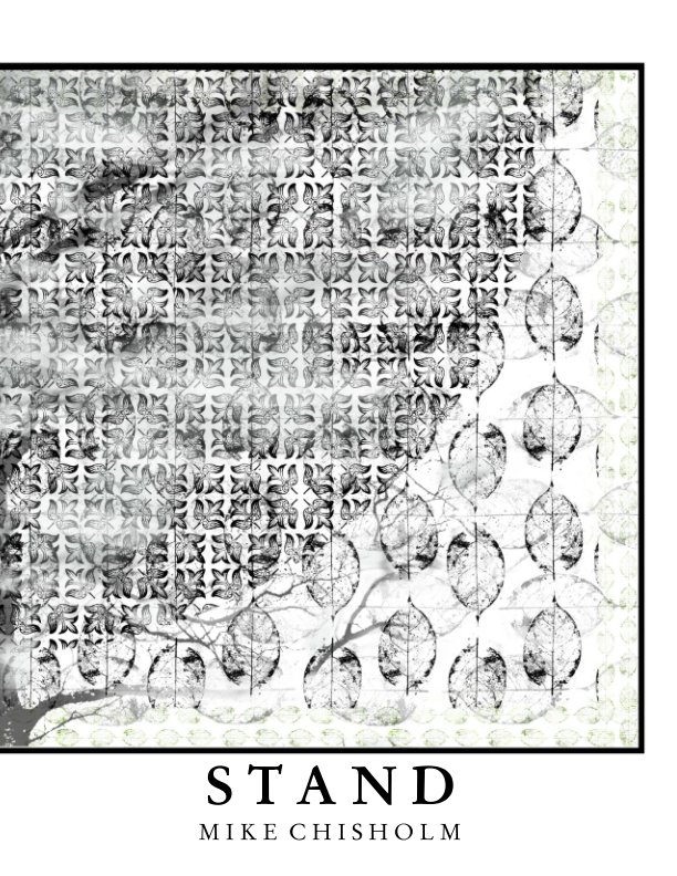
Painting | River Avon mud on linen on wood, by Richard Long
(200 x 520 cm i.e. BIG)

We've been in Bristol for the past week, watching the torrential rain alternate with strong sunshine, and the tidal river Avon fill up and then drain away to muddy nothing twice a day from our fourth-floor vantage point over the Avon Gorge, but on Monday we caught the train to London to see an old friend and her son, who are visiting from the USA. We chose to meet up at the Royal Academy, on the last day of the annual Summer Exhibition.

It's a strangely hybrid event, the RA Summer Exhibition. Essentially, it is a combination of Royal Academicians' own choice of their own work and an open submission call, which has been shortlisted from thousands of online entries by a panel of Academicians, and then refined into a "hang" by particular artists given responsibility for one or more of the fourteen exhibition rooms in the Academy's august premises on Picadilly. I had a major RA success myself by getting a couple of prints into the 2017 show, but since then have failed to get beyond the shortlisted stage. Which is annoying, obviously, but doubly so when you visit and see what has made it to the hang.

A show of over 1500 works is difficult to absorb in a single visit, it goes without saying. Not least when trying at the same time to catch up with someone I have known for over 45 years, a member of my Elective Family, no less, who chose to make her life in America, for reasons I can't begin to remember now. But it's impossible to avoid the impression that, after 250 years, this is an exhibition formula that needs some serious reconsideration. It's stale, and does nobody's work any favours. (I know, I know: those grapes were probably sour, anyway...).

Now, I know a fair bit about art, compared to the average citizen, but not compared with the average RA. I wouldn't choose to arm-wrestle, metaphorically, with the likes of Grayson Perry or Cornelia Parker over what is or is not worthy of selection for the Summer Show. Although if it was a way to get my own stuff in I'd happily offer to actually arm-wrestle either of them: shape up and show me what you've got, Cornelia! But something is clearly wrong with a process that results in such an overwhelming sea of crap.

For a start, there's the salon-style hang: the pictures are too densely crammed together, from low down on the wall to high up: practically 20 feet above your head in some rooms. What possible point is there is in selecting some poor devil's modestly-sized painting or print, only to hang it next to an attention-grabbing, billboard-sized work by some titan of the art world or, worse, way up where no-one not in possession of binoculars can see it? Yes, it's traditional, but no, it doesn't work any more, not when so few of us produce work at salon scale. So, Solution 1:

Be far more selective, and hang fewer works in a more sympathetic eye-level display. Stop treating other people's work as mere decor, and take it as seriously as you do your own.

Then there's the general standard of competence. I get the impression that the Academy is troubled by two accusations: elitism and stuffiness. It's not just the Royal Academy, of course. Everywhere you look, standards of competence have been reduced, generally in the name of "inclusivity", "access", and "relatability". It's so patronising, though: as if the problems of education, racism, class, and gender-bias could be solved just by continually lowering the price of the ticket of entry. Or as if "talent" and "taste" were somehow oppressive attributes, deserving of "disruption", and had absolutely nothing to do with, say, your own election to the Royal Academy. The trouble is, guys, once you drop the severe judgement criteria you apply to your own work and that of your peers, all judgement goes out the window. So, Solution 2:

Stop selecting colourful, incompetent work because you think it makes you look fun and inclusive. By all means be fun and inclusive, but see Solution 1. And give drab a chance!

Now, a cynic might think that Academicians like to select obviously incompetent sunday-painter stuff because it makes them look good by contrast. But I was finding that quite often, when I looked up what seemed to me some egregious piece of rubbish in the List of Works (the hang is anonymous and numbered), it turned out to be the work of an Academician (they can't resist putting "RA" after the name). I mean, what is one to make of work like this?


Hmmm... A weaver bird (?!) and a goldfinch, two of a series of birds painted by Humphrey Ocean RA, available at just £2,700 each (framed, obvs). Admittedly, Mr. Ocean [1] used to be the bassist with Kilburn and the Highroads, but he was elected a Royal Academician in 2004, has been Royal Academy Professor of Perspective (a position once held by Turner) since 2012, and has exhibited at every major British gallery you care to name. I was not, am not, and have not achieved any of the above, needless to say, so what do I know? Well, apart from the suspicion that Humphrey is making an art out of taking the piss. I confess to having had my tastes calibrated in the mid-1970s, when Richard Long was young, Tom Phillips produced an album cover for King Crimson, and even cars were brown. But I was surprised how few people were stopping to absorb and admire Long's enormous, mesmerically rhythmic work of smeared River Avon mud in Gallery 2 (see above). Too drab, too tastefully restrained, too free of readable bien-pensant meaning?  Then, of course, there's the strange case of Rose Wylie OBE RA. Crikey... But, again, what do I know? I mean, clearly, few things are as tedious as those photo-realistic pencil portrait drawings you see all over the Web, or yet another sub-Bonnardian bohemian breakfast table in paint, but – pace Picasso – the remedy for witless skill-for-skill's-sake or oh-so-tasteful retro-cliché is surely not pretending to paint like a mentally-disturbed 6-year-old.  Solution 3:

Make Academicians submit anonymously, like everyone else. Then we'll see whether the ironists stand out from the genuinely incompetent, the truly disturbed, or the actual 6-year-olds.

But I think the real problem is the way those academicians tasked with organising each room decide on their theme after all the submissions are in. For example, this year one room, curated by the sisters Jane and Louise Wilson RA², "showcases work exploring light and time". So, OK, I'm not sure which room this was because, well, it could have been any of them, really, couldn't it? But I'm sure Jane and Louise had a really good look at the shortlisted works (my own distinguished contributions included) and picked out those that best met, kinda sorta, whatever it was they had in mind. Ditto all the other "curated" rooms. I wonder, though: is there a pecking order, so that the more junior RA curators only get to pick through the leftovers, hoping to find enough arguable matches for their putative themes? A certain amount of barrel-scraping must surely ensue, resulting in the rejection of much excellent work (my own distinguished contributions included) that doesn't happen to fit? It would explain a lot. Which brings me to Solution 4:

If you're going to theme rooms, then why not decide and declare the themes upfront, before the submissions come in? It can only improve the quality of the end result. You want "work exploring light and time"? We got work exploring light and time! And thank you for sparing us the not inconsiderable expense of submitting, framing, delivering, and then taking back home our works exploring various other themes we happened to find more interesting.

Proof of the solid sense of my proposed solutions came when, en route to a restorative cup of tea and a lengthy chat we stumbled into an oasis. At the top of some stairs we came upon a small room, containing just five works, some enormous and immersive panoramic colour photographs in the Düsseldorf mode of Andreas Gursky or Thomas Struth, each occupying a wall, and numbered 1574 to 1578. It was beautiful to see work of such obvious, stand-out quality so sympathetically displayed. One in particular – no. 1576, some extraordinary graffiti on a dark wall – had me completely hooked. When I looked it up it turned out to be by honorary RA and favourite film-maker Wim Wenders. In fact, all five photographs were by Wenders. Compared to the fairground chaos of the main rooms it was a haven of concentrated, contemplative calm, well worth the price of admission.

"Deep in the Railroad Tunnel #2, Wuppertal", by Wim Wenders
(183 x 453 cm i.e. BIG)

1. But born, apparently, Humphrey Anthony Erdeswick Butler-Bowdon. No comment.

Sunday 11 August 2019

Stand


Apologies if all these recent reflexive examinations of my own "process", for want of a better word, are getting tedious, but I've been happily trapped in an intensive, recursive loop of making. Make pictures; make book; make more pictures; make another book; revise book; add more pictures; and so on. I may not sell much, or attract much attention from the "gatekeepers" out there, but it keeps me busy, and I'm determined to have a productively selfish decade or two before ... Well, before whatever comes next.

So, having played around for a bit with the panoramic crops that I used in the most recent "layflat" book Arboretum, I then thought, "Hmm, maybe those original square ones weren't so boring, after all". In fact, I realised that a dozen or so of them would make a nice little magazine-style publication. Unfortunately, Blurb's magazines can only be made using their newer BookWright software, which is a nuisance, as the original BookSmart software is still a much better set of tools for knocking out a book that looks like a book, rather than someone's first over-exuberant encounter with desktop publishing. However, I did get some useful BookWright experience both by preparing the Prestidigitation "sampler" in the "magazine" format, and also by making those recent layflat books (which also can only be made in BookWright). So, OK, Blurb, I get the message – you really, really want us to migrate to BookWright – and I have also finally come to see the real advantage of the magazine format: compared to everything else it's far cheaper, and yet gives pretty much the same print quality as their regular books.

Provided, that is, you can live with the choice of having any format you like, so long as it's a portrait-oriented, soft-covered, US letter-sized 11" x 8.5" publication. But, despite this restriction, a magazine still makes a lot of sense for small projects. After all, why expect anyone to pay £20 or more for the luxury of hard covers or a choice of papers (never mind a ridiculous £40 for a 20-page layflat book), when a perfectly decent "book" [1] of a small portfolio, of comparable quality to an exhibition catalogue, can be had for around £5?


So, here it is, at the low, low price of £8.59, which nonetheless yields a profit of £3.00, the same as I usually make on some £50 extravaganza (or would, if anyone ever bought one). I've given it the title Stand. Why? Well, it's one of those usefully ambivalent words, both a noun and a verb, with what felt to me like a number of relevant meanings [2]. If you check out the opening and closing quotations I've used in it you'll probably get the right sort of idea. So, go on, why not treat yourself? Sorry about the price of the postage, though: I have no control at all over that.
I think it's quite an attractive collection of just a dozen or so pictures, all variations on the same theme, using the same repeated set of elements. I'm pleased with how well the "magazine" format has worked out, too, and I'm fairly sure there'll be a few more similar publications to come. It's a really good way to try out provisional states and subsets of work that may or may not grow into a more fully-developed series. Even if it does mean working with BookWright. Maybe I should have called it Stand: issue No. 1 of an irregular periodical, August 2019?

1. It used to annoy the hell out of me, when my mother would refer to a magazine like Woman's Own or Reader's Digest as a "book". I know, I know... I was an appalling little snob. Still am, though, when it comes to printed matter: don't get me started on "coffee-table book" or "giclée"...
2. Irrelevant, but does anyone else who was at a British university in the 60s or 70s remember being sold a copy of Stand poetry magazine personally by Jon Silkin, the editor? He used to tour around flogging the latest issue, presumably from a box in the back of his car. Of course, there were rather fewer "universities" in those days...

Tuesday 6 August 2019

Arboretum


Looking at those square, tree- and leaf-based pictures in the previous post, it struck me that cropping a chunk across the bottom of each would give a more satisfying composition. A square canvas is ideal for a balanced arrangement of elements – it pretty much demands it – but this can be boring, especially when combined with that other most stable shape, the circle. So that's what I did, with what appeared to me to be an instant improvement.

Then, thinking about the way the new shape emphasised the bilateral symmetry, and how much this suits a square "layflat" book, I decided to stretch them sideways a bit to fit a 2:1 frame. Again, the slight distortion seemed to add interest to the resulting picture by an almost imperceptible disruption of the patterning, in the same way as the more attractive "bonds" used to lay bricks in a wall can do. The eye seems to respond positively to subtle variations within an overall uniformity, without necessarily realising why.


So, yet another layflat-style book is in the works, titled Arboretum. Only this time from a new source. I hadn't realised that, unlike their regular books which are made in Europe, Blurb manufactures its layflat books in the USA. Which means that, on top of the initial high price, you pay a higher shipping rate and run the risk of getting a Customs import charge plus Post Office "handling fee", which knocks the stuffing out of even a 40% discount. As a consequence, I had another look at Zno, a US-based enterprise selling a range of mainly cute, ornamental items based on uploaded photos, but whose range also includes layflat books. As I know from a couple of previous purchases, their production values are very high, but when I saw what they had done with a 6" square version of Trine, I was impressed: it's a delightful little thing, much more like a child's "board book" to handle, and very nicely finished. What's more, the delivery charge was comparatively low, it got through customs without any extra charge, and it also arrived twice as fast as the Blurb items.


However, Zno don't run an on-demand shopfront like Blurb, so this one will most likely remain a purely personal production [1]. As a book, that is: I am making it available as a PDF on a home-produced CD in a plastic sleeve with printed insert as usual: £5 + £2.50 post & packing, anywhere in the world. If you're interested, email me (address in the "Complete Profile" top right).


1. ADDED 7/8/19: Today, yet another 40% discount offer arrived from Blurb (this begins to strike me as a little desperate: the presses must be idle in summer) so – acknowledging the risk posed by the eternal vigilance of the Queen's revenue men – I went ahead and created a Blurb version and ordered a copy, which means I can offer it to you. You lucky people! It's here:

Friday 2 August 2019

Skeleton Key


Part of the fun of digital imaging is the ability to create rapidly the sort of variations on a theme that would take many days of work, frustration, and false starts using traditional printmaking methods. The key to this is mastering the simple but powerful concept – originated (I think) in Photoshop but used now in all image-editing software – of blending multiple "layers". A case in point: a few days ago, some noodling around resulted in the picture above. It's a sort of cross between an autumnal and a Pentecostal mood: rushing wind, flames, drifting smoke, that sort thing, and the sort of mildly OTT place I often end up when improvising. I liked the combination of elements enough to dial it back a bit and play around, dropping things in and out, changing blend modes, and so on. FWIW, here are a few of the results so far:


And where did it all start, I hear you ask? Not with the tree, as it happens, but here:


A photo from the late lamented university Valley Garden greenhouses taken in December 2006, which became this:


I can't even remember, now, quite why I felt the need to make a pattern from a skeleton leaf  in the first place, but whatever the original stimulus it has ended up serving as the key to and the armature underlying several rounds of improvisational picture-making. Here's a final sample from a completely different direction of travel to the ones above:


It reminds me strongly of a particular summer night, many years ago. Such a night ... Sweet confusion under the moonlight... But who'd have guessed, back then, what magic would become available to us, to conjure substance out of airy nothing?
And as imagination bodies forth
The forms of things unknown, the poet's pen
Turns them to shapes and gives to airy nothing
A local habitation and a name.
Such tricks hath strong imagination,
That if it would but apprehend some joy,
It comprehends some bringer of that joy;
Or in the night, imagining some fear,
How easy is a bush supposed a bear!
A Midsummer Night's Dream, Act V, scene 1