Thursday 27 August 2020

Three More Three by Four


Here are three more of these "guardians" compilations. Bringing them together like this, I am aware of how far indulging my taste for the grotesque may be unsettling for some. Indeed, it's hard to imagine quite who would want to put a set of pictures like those four above on a wall within their living space. Even I find them a little disturbing.


OTOH, someone must be buying the considerably more grotesque output of the Chapman Brothers, not to mention the work of twins Doug and Mike Starn. Maybe I should invent a brother for myself, or even better, an identical twin? I wouldn't be the first: consider the case of the wonderful Beggarstaff Brothers, or the singular Bob and Roberta Smith. However, given the difficulties banks are now putting in the path of those of us with variant names – even things as mild as "Mike" versus "Michael", or the habitual use of a middle name – it seems less like a good idea. It's hard to imagine how "Bob and Roberta Smith" ever manages to bank his receipts, given his real name is Patrick Brill... Maybe he doesn't sell very much. Maybe that's why.


Sunday 23 August 2020

Three by Four


Largely confined to quarters by the weather, and being in a synthesising frame of mind, I thought I'd see whether I could do something interesting with my series of "guardians" pictures. Looking at them, I could see there were some nice little groups of four that would fit conveniently into some cheap 60cm x 30cm panoramic frames I had bought for some other, forgotten project and which have been sitting around unused in a corner for some time. I think these do actually work rather well together.


However, although I put them together quite quickly, the quantity of original work distilled into these grouped images is much denser than it might appear, superficially: I'd estimate that at least two solid weeks of photoshoppery will have gone into each group of four, not counting the original labour and expenses that went into finding and photographing the raw materials. Let me see... At an hourly rate of, say, £30 [1], I make that around £2,500 each that I ought to recover, one way or another, just to recoup my notional labour costs. Not forgetting the £9.50 each for the classy frames, of course... Ah, well. It's an entirely theoretical calculation, of course, based on self-motivated work nobody had asked me to do, and rather like working out how much you're owed for mowing the lawn, or doing the washing up. Sure, if I were to offer them for sale I'd have to put a realistic price on them but, in the end, the only thing that matters is that they represent time well spent.


1. Artists' Union England hourly rate for someone with 5+ years of experience is £33.83.


Wednesday 19 August 2020

Special Edition 2


The nice thing about having a completed photo project to play around with is that you can concentrate on the setting, rather than the content. In many ways, this is more fun, and it's certainly a satisfying way to pass a series of gloomy, rainy days such as we've been having this week. Certain commenters on the Let's Get Lost book (eminent, self-regarding types, in the main, who AFAIK don't read this blog) implied – if fairly discreetly, to the point of deniability – that I was rather better at book-design than at originating photographic material, which may well be a fair comment, even if it has cost them a free copy.

The nice thing about a fantasy book is that it can have different-sized pages for portrait and landscape oriented photographs, which is always a major book-design headache, and one which can only really be overcome by using square pages, or disguised by playing around with the size and placing of the images, which – if done well – can have design benefits, by varying the "rhythm" of the book, and so on. It usually isn't done well, though: for example, I have yet to see a conventionally bound book where splashing pictures across the central "gutter" works to the benefit of the content. Yes, it looked great laid out flat on the screen in InDesign, but is pretty annoying as a 3-D object in the hand.


Friday 14 August 2020

Special Edition


While we were in Bristol we paid our customary visit to the Oxfam Bookshop in Clifton, masked-up like freelance book-surgeons, and spent an enjoyable half-hour browsing and deciding what not to buy. I was struck by the presence of some unusually desirable photo-books, most of which I already have – phew! – but also by a surprising number of Folio Society editions, which always intrigue me when they turn up in charity shops, given how expensive they are. Someone's shelves had clearly been given a radical clear-out.

If you don't know their productions, the Folio Society is a book club, specialising in luxury or "crafted" editions of classic books, ancient and modern, which is to say large, illustrated, slip-cased, highly decorative books, with good printing on the best paper, the sort of thing that lines the bookshelves of a certain sort of reader. Not mine, though, I should say. Although some are quite beautiful, most are just rather OTT or, to be honest, even slightly naff to the true bibliophile. I mean, much as I have enjoyed reading Lee Child's Jack Reacher books – highly recommended to anyone who has ever fantasised about being eight-foot tall and an invincible dispenser of rough justice in an unfair world – why would I or anyone want a cloth-bound, illustrated edition of Killing Floor, costing £50? It would be like having a jewel-encrusted bus-pass holder.

However, it did make me wonder what my own recent production Let's Get Lost would look like in a "sumptuous", no-expense-spared version. So I decided to mock up some page-spreads for myself – nothing too fancy, naturally – and I must admit I was quite pleased with the results, especially when presented as if "float-mounted" onto a larger sheet of rough-textured paper. I think they'd look pretty fine sympathetically framed on a wall, and are in a way more pleasing to the eye and certainly more practical than they would be contained within the covers of some actual, over-sized, over-produced book. As one astute commenter on the Folio Society's website put it, when reviewing their edition of A Pilgrim's Progress (illustrated by William Blake, and a mere £295): "A beautifully produced book which would look good on the shelf, but too heavy and unwieldy to actually read".


Monday 10 August 2020

Instagram

 Here's a question for you: do you use Instagram? If the answer is yes, and particularly if you are a photographer or artist, what do you use it for? Has it brought you any benefits, beyond attracting the occasional "like" or "nice pic!" comment? I'd be interested to hear.

I ask because people have sometimes asked me, "Are you on Instagram?", but, now that I have finally got around to looking into it, it seems like an essentially ephemeral platform. Crucially, it is also entirely phone-based. I was amazed to discover that, officially, you can only upload image files to it from your phone. True, it can be gamed by using 3rd-party apps or by exploiting various cunning back-door ways in, but in spirit it's a phone-only app. Worse, it can't be downloaded in its current incarnation onto my antique iPhone 4s.

Why have I finally got around to looking at something that others have been using for years, and which is probably already past its peak? Well, clearly, I put a lot of work into this blog, and have recently updated my website, but the audience for all this effort – both visual and written – remains very small: I'd estimate that I have around fifty regular readers, a number which has remained constant for years now. It doesn't do to get grandiose about the size of readership one might expect to accumulate, but I hope you'd agree that this is good stuff that deserves an audience in three figures, at least! I suspect part of the problem is that I lack a presence in the social media world – for whatever reason [1], it seems none of my blog posts ever gets linked to Twitter or Facebook, which is not something I can have any influence over – so I'm in a Muhammad-mountain situation.

So I would be willing to duplicate some of the effort that goes into this blog on another platform like Instagram to attract a bigger audience, but only if that audience was likely to do more than glimpse at a phone-sized image, click a "like" button, and move on. Who needs that kind of attention? Which probably means, who needs Instagram?

1. TBH I expect that my fifty loyal readers are rather like me, and have no presence on either Twitter or Facebook.


Thursday 6 August 2020

Arboretum


I thought the "Stand" cut-out looked a bit too boringly regular, so I merged it with elements from its close relative, Arboretum, in the hope of making something a bit more pleasing to the eye. I think this does work better. It wouldn't make such a good cut-out book, probably, but it's easy to forget that's not really the point. This was something that I was reminded of when, on impulse, I ordered a "print behind vinyl glass" of the original version from an excellent German-based printing setup called Whitewall, partly because they were having a sale (who isn't at the moment? It's vulture time... Hang in there, guys!), and partly because I just wanted to see if it really would work, presented that way. It's a handsome thing, no doubt, but – as a 40cm square slab of shiny vinyl – the intentional irony of its cut-outness takes a closer examination to be evident. First and foremost, it's a picture to mount on the wall.


We're having a change of scenery at our Bristol flat this week, which is always good, but particularly welcome after nearly six months at home, or skulking around the streets and supermarkets of just one suburb of Southampton. It's always quite a dramatic change, as the flat is in a block that stands on one side of the Avon Gorge, with an uninterrupted view across to the other, heavily wooded side. Even knowing that the busy A369 road lies just over the tree-lined horizon, you can easily imagine the view as virgin territory, inhabited by wolves and bears, as the uncrossable tidal river rises and falls twice a day in its long cradle of muddy rock, and the buzzards circle overhead. For some reason, this week I became fascinated by the clouds that pass along behind the trees, and began leaning out of the window to grab shots of them. With a bit more care, there's a nice panorama that could be constructed of the entire horizon. Maybe tomorrow.

Sunday 2 August 2020

Let's Get Completely Lost


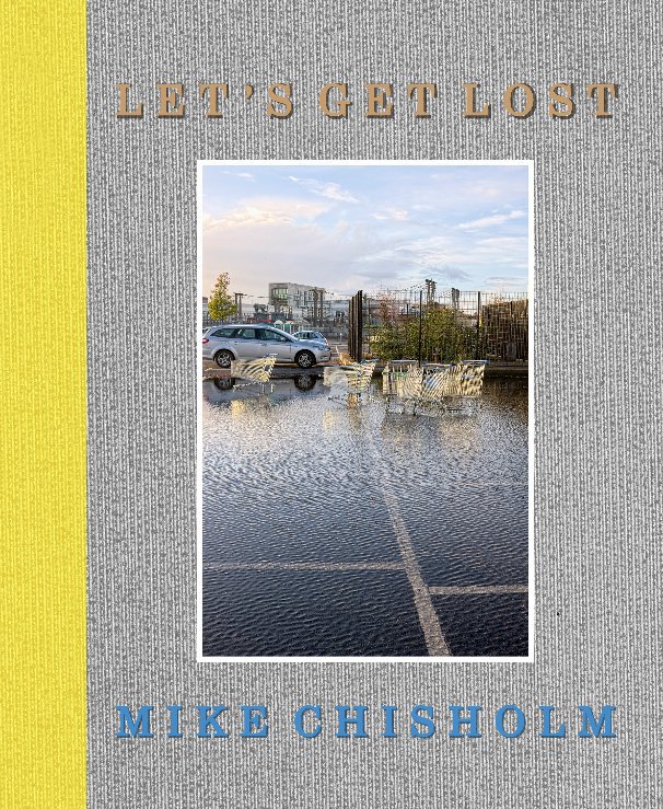
Back in June I reported that I was finally getting somewhere with what had started out as a "postcards" project, loosely based on Luigi Ghirri's book Kodachrome, under the title Let's Get Lost [1]. In the meantime I've sent out copies of a PDF of the first draft for comments, which have been both useful and encouraging, and have been revising both the content and, for want of a better word, the container. Even at a reduced 116 pages it's still quite large, and not cheap as an on-demand Blurb book. I have been looking into the possibilities of "proper" self-publication with a trusted printer/publisher (Kozu), but I'm very cautious about that: the price per copy would work out much cheaper but, even as a short-run production, a couple of boxes of unsold copies under the bed would represent a serious financial investment in dust-bunnies. I'd probably end up giving them away.

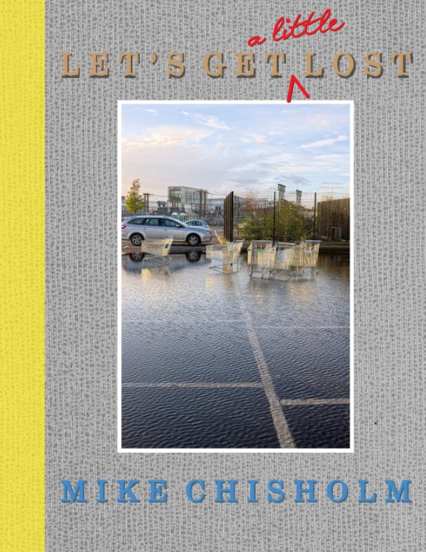
As far as a Blurb book is concerned, I think I've now taken this as far as I want to, and so have made it available in two forms:
Above is the full thing, an 8" x 10" book of 116 pages, available in paperback (£39.99) or in hardback (£49.99). I know: Ouch! Of course, there's always the full PDF at £6.99, but no-one ever seems to buy those, which is a mystery to me: you get the full thing, dirt cheap, in a universally "portable" format, with the images in their original state, un-muddied by printing onto paper [2].

Below is the condensed version, Let's Get (a little) Lost. It's in Blurb's "magazine" format, which is slightly larger ("American letter size", i.e. 8.5" x 11"), but edited ruthlessly down to a mere 64 pages (£14.99). I think it still works perfectly well as a book sequence, although I see no point in making it available as a PDF, when it would be the same price as the full 116 pages.


I must admit I'm dithering about the possibility of self-publication. Back before on-demand publishers like Lulu and Blurb appeared on the scene, I did set up and register my own publishing brand, Shepherd's Crown, and bought a batch of ISBNs linked to it, some of which still remain unused. But I quickly learned the dust-bunny lesson, referred to above. You can publish it, but they will not come. At all. In fact, it's quite striking how long even a well-reviewed, commercially-published, signed and numbered limited-edition photo-book can remain available, even to the point of being offered at a substantial discount by booksellers several years on. It's a very "niche" business. Nice as it would be to have fuller control over the final product than is possible via Blurb's book-making tools – and above all to bring the price down – what would be the point, if no-one will buy the thing anyway? So-called "vanity publishing" is a notoriously doomed enterprise, but to be one's own vanity publisher is not so much vanity as insanity.

Blurb's business model is, in the end, a clever one: satisfy your urge to make several books a year, without the drain on your finances or, ultimately, the need to buy a bigger house. There is, after all, an enormous difference between buying one book for yourself at £25 or even £50, which is available for sale in a personal online "bookstore" managed by Blurb, and buying 100 copies of pretty much the same thing at £7.50 each, which you then have to market and distribute yourself, when you are highly unlikely to sell copies into double figures of either. Although it has to be said that their increasingly frequent "40% off" sales would suggest it's also a business model that is not quite delivering, for them, as expected. Hang in there, Blurb!

1. The title of a song indelibly associated with West Coast jazz trumpeter Chet Baker, to the extent it is also the title of a recent biopic. Pretty much the only thing we have in common is having our front teeth knocked out, clearly more of a problem in his case than mine.
2. It would help, I think, if Blurb embedded the optimal viewing settings in Acrobat (I have proposed this to them), which are:
Under the menu "View" select "Page Display", and choose both of "Two Page View" and "Show Cover Page in Two Page View". Personally, I also like to choose "show gaps between pages", and to reduce the size of the book in the viewing window by one click, but those are more a matter of taste.