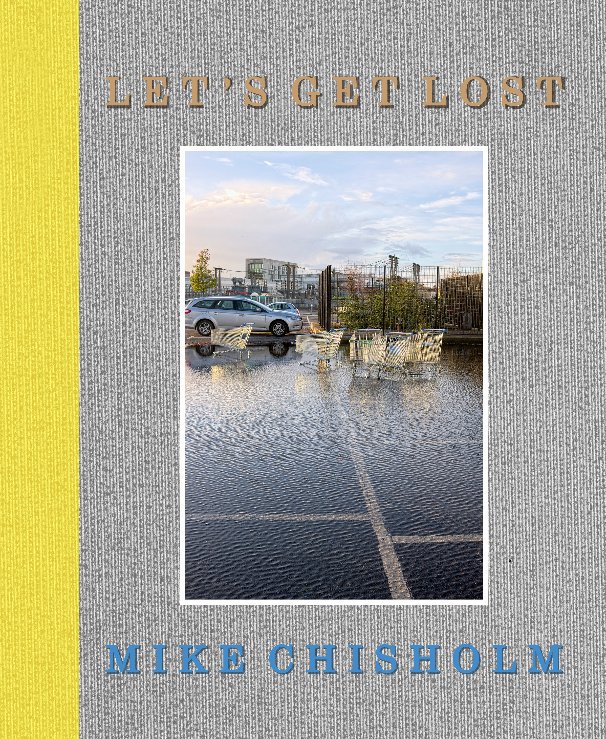
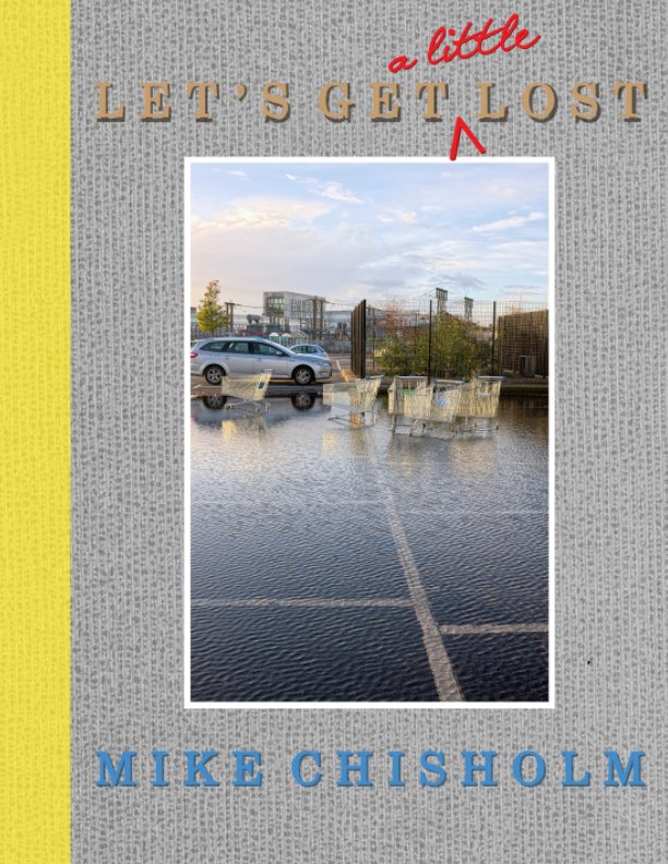
As far as a Blurb book is concerned, I think I've now taken this as far as I want to, and so have made it available in two forms:
1. The title of a song indelibly associated with West Coast jazz trumpeter Chet Baker, to the extent it is also the title of a recent biopic. Pretty much the only thing we have in common is having our front teeth knocked out, clearly more of a problem in his case than mine.
Above is the full thing, an 8" x 10" book of 116 pages, available in paperback (£39.99) or in hardback (£49.99). I know: Ouch! Of course, there's always the full PDF at £6.99, but no-one ever seems to buy those, which is a mystery to me: you get the full thing, dirt cheap, in a universally "portable" format, with the images in their original state, un-muddied by printing onto paper [2].
Below is the condensed version, Let's Get (a little) Lost. It's in Blurb's "magazine" format, which is slightly larger ("American letter size", i.e. 8.5" x 11"), but edited ruthlessly down to a mere 64 pages (£14.99). I think it still works perfectly well as a book sequence, although I see no point in making it available as a PDF, when it would be the same price as the full 116 pages.
I must admit I'm dithering about the possibility of self-publication. Back before on-demand publishers like Lulu and Blurb appeared on the scene, I did set up and register my own publishing brand, Shepherd's Crown, and bought a batch of ISBNs linked to it, some of which still remain unused. But I quickly learned the dust-bunny lesson, referred to above. You can publish it, but they will not come. At all. In fact, it's quite striking how long even a well-reviewed, commercially-published, signed and numbered limited-edition photo-book can remain available, even to the point of being offered at a substantial discount by booksellers several years on. It's a very "niche" business. Nice as it would be to have fuller control over the final product than is possible via Blurb's book-making tools – and above all to bring the price down – what would be the point, if no-one will buy the thing anyway? So-called "vanity publishing" is a notoriously doomed enterprise, but to be one's own vanity publisher is not so much vanity as insanity.
Blurb's business model is, in the end, a clever one: satisfy your urge to make several books a year, without the drain on your finances or, ultimately, the need to buy a bigger house. There is, after all, an enormous difference between buying one book for yourself at £25 or even £50, which is available for sale in a personal online "bookstore" managed by Blurb, and buying 100 copies of pretty much the same thing at £7.50 each, which you then have to market and distribute yourself, when you are highly unlikely to sell copies into double figures of either. Although it has to be said that their increasingly frequent "40% off" sales would suggest it's also a business model that is not quite delivering, for them, as expected. Hang in there, Blurb!
2. It would help, I think, if Blurb embedded the optimal viewing settings in Acrobat (I have proposed this to them), which are:
Under the menu "View" select "Page Display", and choose both of "Two Page View" and "Show Cover Page in Two Page View". Personally, I also like to choose "show gaps between pages", and to reduce the size of the book in the viewing window by one click, but those are more a matter of taste.


5 comments:
In my experience, Blurb offers a substantial discount if you order at least five books at once. Of course, in this case fulfillment of orders is entirely up to you. On the other hand, five books do not consume a lot of space, so a lot of book projects fit under your bed ;^)
For my own Stillgewässer book, I resorted to inkjet printing and hand binding. This was fun and I like the look and haptics better than what I got from Blurb, at a considerably lower expense (if you don't consider the work, that is). The initial edition is five copies, but since nobody is going to buy it anyway, I think it is sufficient. For the same reason, fulfillment isn't a big deal, either. Happy times!
Best, Thomas
I find myself wondering how you came to have your teeth knocked out Mike…
Stephen,
A very brief and one-sided brawl behind a pub when I was 17...
Mike
I like the book. Some wonderful image combos, although I don't understand the section logic. What I do find annoying is the place/date text on every page. I know for non photographers the first question is: "Where's that?" Nonetheless, I'd prefer the listing page at the end, as is common with many photo books. I know you're not going to change it now, but that's my 2 cents any way.
Kent,
Thanks. The place & date is part of the DNA inherited from Ghirri's "Kodachrome". I did think about doing what you suggest, but liked the immediacy of having them beneath the actual photos, and the extra dimension of comparison between the pairs.
Mike
Post a Comment