Friday, 16 August 2019

Sour Grape Solution


Painting | River Avon mud on linen on wood, by Richard Long
(200 x 520 cm i.e. BIG)

We've been in Bristol for the past week, watching the torrential rain alternate with strong sunshine, and the tidal river Avon fill up and then drain away to muddy nothing twice a day from our fourth-floor vantage point over the Avon Gorge, but on Monday we caught the train to London to see an old friend and her son, who are visiting from the USA. We chose to meet up at the Royal Academy, on the last day of the annual Summer Exhibition.

It's a strangely hybrid event, the RA Summer Exhibition. Essentially, it is a combination of Royal Academicians' own choice of their own work and an open submission call, which has been shortlisted from thousands of online entries by a panel of Academicians, and then refined into a "hang" by particular artists given responsibility for one or more of the fourteen exhibition rooms in the Academy's august premises on Picadilly. I had a major RA success myself by getting a couple of prints into the 2017 show, but since then have failed to get beyond the shortlisted stage. Which is annoying, obviously, but doubly so when you visit and see what has made it to the hang.

A show of over 1500 works is difficult to absorb in a single visit, it goes without saying. Not least when trying at the same time to catch up with someone I have known for over 45 years, a member of my Elective Family, no less, who chose to make her life in America, for reasons I can't begin to remember now. But it's impossible to avoid the impression that, after 250 years, this is an exhibition formula that needs some serious reconsideration. It's stale, and does nobody's work any favours. (I know, I know: those grapes were probably sour, anyway...).

Now, I know a fair bit about art, compared to the average citizen, but not compared with the average RA. I wouldn't choose to arm-wrestle, metaphorically, with the likes of Grayson Perry or Cornelia Parker over what is or is not worthy of selection for the Summer Show. Although if it was a way to get my own stuff in I'd happily offer to actually arm-wrestle either of them: shape up and show me what you've got, Cornelia! But something is clearly wrong with a process that results in such an overwhelming sea of crap.

For a start, there's the salon-style hang: the pictures are too densely crammed together, from low down on the wall to high up: practically 20 feet above your head in some rooms. What possible point is there is in selecting some poor devil's modestly-sized painting or print, only to hang it next to an attention-grabbing, billboard-sized work by some titan of the art world or, worse, way up where no-one not in possession of binoculars can see it? Yes, it's traditional, but no, it doesn't work any more, not when so few of us produce work at salon scale. So, Solution 1:

Be far more selective, and hang fewer works in a more sympathetic eye-level display. Stop treating other people's work as mere decor, and take it as seriously as you do your own.

Then there's the general standard of competence. I get the impression that the Academy is troubled by two accusations: elitism and stuffiness. It's not just the Royal Academy, of course. Everywhere you look, standards of competence have been reduced, generally in the name of "inclusivity", "access", and "relatability". It's so patronising, though: as if the problems of education, racism, class, and gender-bias could be solved just by continually lowering the price of the ticket of entry. Or as if "talent" and "taste" were somehow oppressive attributes, deserving of "disruption", and had absolutely nothing to do with, say, your own election to the Royal Academy. The trouble is, guys, once you drop the severe judgement criteria you apply to your own work and that of your peers, all judgement goes out the window. So, Solution 2:

Stop selecting colourful, incompetent work because you think it makes you look fun and inclusive. By all means be fun and inclusive, but see Solution 1. And give drab a chance!

Now, a cynic might think that Academicians like to select obviously incompetent sunday-painter stuff because it makes them look good by contrast. But I was finding that quite often, when I looked up what seemed to me some egregious piece of rubbish in the List of Works (the hang is anonymous and numbered), it turned out to be the work of an Academician (they can't resist putting "RA" after the name). I mean, what is one to make of work like this?


Hmmm... A weaver bird (?!) and a goldfinch, two of a series of birds painted by Humphrey Ocean RA, available at just £2,700 each (framed, obvs). Admittedly, Mr. Ocean [1] used to be the bassist with Kilburn and the Highroads, but he was elected a Royal Academician in 2004, has been Royal Academy Professor of Perspective (a position once held by Turner) since 2012, and has exhibited at every major British gallery you care to name. I was not, am not, and have not achieved any of the above, needless to say, so what do I know? Well, apart from the suspicion that Humphrey is making an art out of taking the piss. I confess to having had my tastes calibrated in the mid-1970s, when Richard Long was young, Tom Phillips produced an album cover for King Crimson, and even cars were brown. But I was surprised how few people were stopping to absorb and admire Long's enormous, mesmerically rhythmic work of smeared River Avon mud in Gallery 2 (see above). Too drab, too tastefully restrained, too free of readable bien-pensant meaning?  Then, of course, there's the strange case of Rose Wylie OBE RA. Crikey... But, again, what do I know? I mean, clearly, few things are as tedious as those photo-realistic pencil portrait drawings you see all over the Web, or yet another sub-Bonnardian bohemian breakfast table in paint, but – pace Picasso – the remedy for witless skill-for-skill's-sake or oh-so-tasteful retro-cliché is surely not pretending to paint like a mentally-disturbed 6-year-old.  Solution 3:

Make Academicians submit anonymously, like everyone else. Then we'll see whether the ironists stand out from the genuinely incompetent, the truly disturbed, or the actual 6-year-olds.

But I think the real problem is the way those academicians tasked with organising each room decide on their theme after all the submissions are in. For example, this year one room, curated by the sisters Jane and Louise Wilson RA², "showcases work exploring light and time". So, OK, I'm not sure which room this was because, well, it could have been any of them, really, couldn't it? But I'm sure Jane and Louise had a really good look at the shortlisted works (my own distinguished contributions included) and picked out those that best met, kinda sorta, whatever it was they had in mind. Ditto all the other "curated" rooms. I wonder, though: is there a pecking order, so that the more junior RA curators only get to pick through the leftovers, hoping to find enough arguable matches for their putative themes? A certain amount of barrel-scraping must surely ensue, resulting in the rejection of much excellent work (my own distinguished contributions included) that doesn't happen to fit? It would explain a lot. Which brings me to Solution 4:

If you're going to theme rooms, then why not decide and declare the themes upfront, before the submissions come in? It can only improve the quality of the end result. You want "work exploring light and time"? We got work exploring light and time! And thank you for sparing us the not inconsiderable expense of submitting, framing, delivering, and then taking back home our works exploring various other themes we happened to find more interesting.

Proof of the solid sense of my proposed solutions came when, en route to a restorative cup of tea and a lengthy chat we stumbled into an oasis. At the top of some stairs we came upon a small room, containing just five works, some enormous and immersive panoramic colour photographs in the Düsseldorf mode of Andreas Gursky or Thomas Struth, each occupying a wall, and numbered 1574 to 1578. It was beautiful to see work of such obvious, stand-out quality so sympathetically displayed. One in particular – no. 1576, some extraordinary graffiti on a dark wall – had me completely hooked. When I looked it up it turned out to be by honorary RA and favourite film-maker Wim Wenders. In fact, all five photographs were by Wenders. Compared to the fairground chaos of the main rooms it was a haven of concentrated, contemplative calm, well worth the price of admission.

"Deep in the Railroad Tunnel #2, Wuppertal", by Wim Wenders
(183 x 453 cm i.e. BIG)

1. But born, apparently, Humphrey Anthony Erdeswick Butler-Bowdon. No comment.

Sunday, 11 August 2019

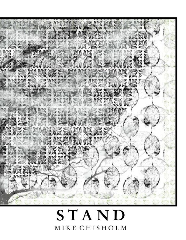
Stand


Apologies if all these recent reflexive examinations of my own "process", for want of a better word, are getting tedious, but I've been happily trapped in an intensive, recursive loop of making. Make pictures; make book; make more pictures; make another book; revise book; add more pictures; and so on. I may not sell much, or attract much attention from the "gatekeepers" out there, but it keeps me busy, and I'm determined to have a productively selfish decade or two before ... Well, before whatever comes next.

So, having played around for a bit with the panoramic crops that I used in the most recent "layflat" book Arboretum, I then thought, "Hmm, maybe those original square ones weren't so boring, after all". In fact, I realised that a dozen or so of them would make a nice little magazine-style publication. Unfortunately, Blurb's magazines can only be made using their newer BookWright software, which is a nuisance, as the original BookSmart software is still a much better set of tools for knocking out a book that looks like a book, rather than someone's first over-exuberant encounter with desktop publishing. However, I did get some useful BookWright experience both by preparing the Prestidigitation "sampler" in the "magazine" format, and also by making those recent layflat books (which also can only be made in BookWright). So, OK, Blurb, I get the message – you really, really want us to migrate to BookWright – and I have also finally come to see the real advantage of the magazine format: compared to everything else it's far cheaper, and yet gives pretty much the same print quality as their regular books.

Provided, that is, you can live with the choice of having any format you like, so long as it's a portrait-oriented, soft-covered, US letter-sized 11" x 8.5" publication. But, despite this restriction, a magazine still makes a lot of sense for small projects. After all, why expect anyone to pay £20 or more for the luxury of hard covers or a choice of papers (never mind a ridiculous £40 for a 20-page layflat book), when a perfectly decent "book" [1] of a small portfolio, of comparable quality to an exhibition catalogue, can be had for around £5?


So, here it is, at the low, low price of £8.59, which nonetheless yields a profit of £3.00, the same as I usually make on some £50 extravaganza (or would, if anyone ever bought one). I've given it the title Stand. Why? Well, it's one of those usefully ambivalent words, both a noun and a verb, with what felt to me like a number of relevant meanings [2]. If you check out the opening and closing quotations I've used in it you'll probably get the right sort of idea. So, go on, why not treat yourself? Sorry about the price of the postage, though: I have no control at all over that.
I think it's quite an attractive collection of just a dozen or so pictures, all variations on the same theme, using the same repeated set of elements. I'm pleased with how well the "magazine" format has worked out, too, and I'm fairly sure there'll be a few more similar publications to come. It's a really good way to try out provisional states and subsets of work that may or may not grow into a more fully-developed series. Even if it does mean working with BookWright. Maybe I should have called it Stand: issue No. 1 of an irregular periodical, August 2019?

1. It used to annoy the hell out of me, when my mother would refer to a magazine like Woman's Own or Reader's Digest as a "book". I know, I know... I was an appalling little snob. Still am, though, when it comes to printed matter: don't get me started on "coffee-table book" or "giclée"...
2. Irrelevant, but does anyone else who was at a British university in the 60s or 70s remember being sold a copy of Stand poetry magazine personally by Jon Silkin, the editor? He used to tour around flogging the latest issue, presumably from a box in the back of his car. Of course, there were rather fewer "universities" in those days...

Tuesday, 6 August 2019

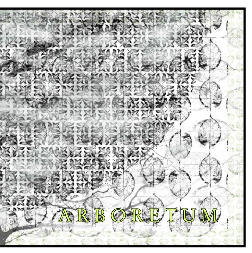
Arboretum


Looking at those square, tree- and leaf-based pictures in the previous post, it struck me that cropping a chunk across the bottom of each would give a more satisfying composition. A square canvas is ideal for a balanced arrangement of elements – it pretty much demands it – but this can be boring, especially when combined with that other most stable shape, the circle. So that's what I did, with what appeared to me to be an instant improvement.

Then, thinking about the way the new shape emphasised the bilateral symmetry, and how much this suits a square "layflat" book, I decided to stretch them sideways a bit to fit a 2:1 frame. Again, the slight distortion seemed to add interest to the resulting picture by an almost imperceptible disruption of the patterning, in the same way as the more attractive "bonds" used to lay bricks in a wall can do. The eye seems to respond positively to subtle variations within an overall uniformity, without necessarily realising why.


So, yet another layflat-style book is in the works, titled Arboretum. Only this time from a new source. I hadn't realised that, unlike their regular books which are made in Europe, Blurb manufactures its layflat books in the USA. Which means that, on top of the initial high price, you pay a higher shipping rate and run the risk of getting a Customs import charge plus Post Office "handling fee", which knocks the stuffing out of even a 40% discount. As a consequence, I had another look at Zno, a US-based enterprise selling a range of mainly cute, ornamental items based on uploaded photos, but whose range also includes layflat books. As I know from a couple of previous purchases, their production values are very high, but when I saw what they had done with a 6" square version of Trine, I was impressed: it's a delightful little thing, much more like a child's "board book" to handle, and very nicely finished. What's more, the delivery charge was comparatively low, it got through customs without any extra charge, and it also arrived twice as fast as the Blurb items.


However, Zno don't run an on-demand shopfront like Blurb, so this one will most likely remain a purely personal production [1]. As a book, that is: I am making it available as a PDF on a home-produced CD in a plastic sleeve with printed insert as usual: £5 + £2.50 post & packing, anywhere in the world. If you're interested, email me (address in the "Complete Profile" top right).


1. ADDED 7/8/19: Today, yet another 40% discount offer arrived from Blurb (this begins to strike me as a little desperate: the presses must be idle in summer) so – acknowledging the risk posed by the eternal vigilance of the Queen's revenue men – I went ahead and created a Blurb version and ordered a copy, which means I can offer it to you. You lucky people! It's here:

Friday, 2 August 2019

Skeleton Key


Part of the fun of digital imaging is the ability to create rapidly the sort of variations on a theme that would take many days of work, frustration, and false starts using traditional printmaking methods. The key to this is mastering the simple but powerful concept – originated (I think) in Photoshop but used now in all image-editing software – of blending multiple "layers". A case in point: a few days ago, some noodling around resulted in the picture above. It's a sort of cross between an autumnal and a Pentecostal mood: rushing wind, flames, drifting smoke, that sort thing, and the sort of mildly OTT place I often end up when improvising. I liked the combination of elements enough to dial it back a bit and play around, dropping things in and out, changing blend modes, and so on. FWIW, here are a few of the results so far:


And where did it all start, I hear you ask? Not with the tree, as it happens, but here:


A photo from the late lamented university Valley Garden greenhouses taken in December 2006, which became this:


I can't even remember, now, quite why I felt the need to make a pattern from a skeleton leaf  in the first place, but whatever the original stimulus it has ended up serving as the key to and the armature underlying several rounds of improvisational picture-making. Here's a final sample from a completely different direction of travel to the ones above:


It reminds me strongly of a particular summer night, many years ago. Such a night ... Sweet confusion under the moonlight... But who'd have guessed, back then, what magic would become available to us, to conjure substance out of airy nothing?
And as imagination bodies forth
The forms of things unknown, the poet's pen
Turns them to shapes and gives to airy nothing
A local habitation and a name.
Such tricks hath strong imagination,
That if it would but apprehend some joy,
It comprehends some bringer of that joy;
Or in the night, imagining some fear,
How easy is a bush supposed a bear!
A Midsummer Night's Dream, Act V, scene 1

Tuesday, 30 July 2019

Original In Colour


Burning Man (original in colour)

If you've ever looked through art books printed in the years before full-colour printing became the default, cheap option, you'll be familiar with the words, "original in colour". Many, if not all of the illustrative plates in those books would be monochrome renderings of famous paintings, which, in the world of black and white newspapers, magazines, and TV, seemed a perfectly normal thing. If you flip through the boxes of old exhibition catalogues and art monographs that you can still find in second-hand bookshops (assuming you can find one of those), it's amazing what a drab and disappointing experience this is. A promising-looking publication on Bonnard or Matisse turns out to be full of grey, slightly soft, poorly-reproduced photographs of paintings, lacking even any of the qualities of good monochrome photography: the caption "original in colour" was not so much explanatory as an apologetic shrug. Go back a hundred years, and what you get instead of photographs, naturally, are engravings of famous paintings. Also in black and white, but at least having the characteristic crisp vigour of line and hatched shade of the cut woodblock or etched plate.

This has everything to do with the available technologies of printing and reproduction, of course [1]. When Walter Benjamin wrote his famous essay "The Work of Art in the Age of Mechanical Reproduction" it was the mid-1930s, and he could only have vaguely intuited how excellent the "mechanical reproduction" of art would become in another 50 years; something it's easy to forget when reading that essay now. As I am sure I must have commented before, for those of us who grew up seeing our art exclusively in full-colour reproduction, the disappointment often turns out to be seeing the original work on a gallery wall. It's not just that a good, book-sized reproduction can be more pleasing than an original wall-sized painting (although I'd maintain that is often the case), but also that – for the suburban, small-town enthusiast without access to a gallery (i.e. most of us) – the experience of "art" is a postcard-sized experience of mediation, almost entirely derived from books, magazines, album covers, TV, and posters. With the result that, yes, I did actually prefer browsing the Tate's superb catalogue of Bonnard's paintings to walking the crowded floors of their recent blockbuster exhibition, trying to get a good look at the door-sized canvases. Quite apart from the relative affordability of the catalogue, I have no idea what I would do with just one of those paintings – where on earth would I put it? – if some wealthy patron were to present me with one [2]. To experience art in its original, unique, unmediated form is to be reminded of its essential exclusivity. Until, that is, the "age of mechanical reproduction".

However, as all admirers of photography know, monochrome, done well, has its own special magic. Again, the century-long domination of "black and white" in photography owes more to available reproductive technology than aesthetic preference, although it is clear that the one seems always to end up driving the other. After all, there's absolutely no reason to persist with obsolete printing techniques like the woodcut, the lithograph, or the screenprint other than the specific qualities of the mark-making they allow, and the cachet these have attracted, once divorced from real-life commercial operations. So, now that all photography has for some time now by default been in colour, the choice of monochrome is a conscious, semi-retro aesthetic choice, made by those who appreciate the qualities of the mark-making it allows, and the cachet it attracts, now that it is divorced from real-life commercial operations. As I say, done well, it has its own special magic. Done badly, of course, it stinks.

Berlin Bird (original in colour)

The thing is, subtract colour from the world, and other, less obvious qualities get a chance to emerge. It's a bit like chairing a meeting, and silencing the dominant, more voluble members, so that the shyer attendees can air their views, and make their own thoughtful, but too often ignored contributions to the debate. Yes, yes, beautiful and eye-catching colours, but what about shape, tone, texture, shadow and light, and their relative weights across the whole picture? All so much easier to see, when colour keeps its big mouth shut.

Now, self-evidently, I do prefer to work in colour. A long time ago in the mid-1980s I did learn to process 35mm and medium-format black and white film, and how to produce a "fine print" in the darkroom, but I never came to love it the way some do. Frankly, I regarded it as a bit of a chore – or rather, an unforgiving chain of chores – but in the resigned way you accept the necessity of changing nappies or doing the washing up. Needs must... Then digital came along. I wrote a post about this way back in June 2009 (Tears in the Stop Bath) which got some attention on TOP at the time, and was probably what brought many of the earliest readers to this blog. In short, the advent of digital photography was a total liberation: no more nappies, no more washing up, no more tears in the stop bath! Clearly, as with colour, monochrome photography has become significantly easier and more "creative" with the digital tools available, but even so I haven't really produced a significant body of monochrome work since White Crow Telescope in 2010. However, for whatever reason, that phrase "original in colour" popped into my mind recently, and the idea of rendering some of my colourful photo-collages into monochrome versions popped up alongside it. If nothing else, it seemed like a nice, appropriated title to hang a project on, along the lines of "Five Leaves Left" [3], or "Unconditionally Guaranteed", and a handy way to reheat revisit some existing work.

So far, I haven't done much about it, other than to try draining all the colour out a few more or less randomly-selected pictures (there's a special little plug at the bottom – disposing of the used colour is less of an environmental problem than I'd feared). I've been printing them on a range of exotic paper samples I've had hanging around for ages. Of these, I'm quite keen on some thin Japanese kozo papers from Awagami, almost a tissue paper at 42g/m², although they are a bit of a challenge to get right. A large part of the point of monochrome is to enjoy the quality of the tonality. I was taught by the late Mike Skipper, in the classic style, to look for a complete range of tones in a print, from the blackest black to the whitest white, but there are other, more subtle traditions, for example the use of "alternative" processes like platinum/palladium, of which Pradip Malde is a master. These kozo papers push the tones into that warm, luminous spectrum of compressed greys so characteristic of alt processes, something I'm not yet entirely comfortable with. I know I won't want to use conventional photo papers for these pictures, however, so I'll probably end up using some compromise like Epson's own "Watercolor" paper, or Hahnemühle's "German Etching", which combine an attractive texture with the capacity to print a proper deep black.

I think what I'm finding attractive about this is the way turning an existing colour image into a satisfying range of tones – whether from blackest black to whitest white, or some more limited scale of ethereal greys – can cast a unifying filter over everything. Obvious, really, but it does make the whole thing look more coherent, somehow, and less constructed, as if I had sat down and worked the picture up from scratch on a blank canvas. Even though that's precisely what I did do, in the first place! Beyond simple appearances, though, I suppose it's a question of giving the eye a different kind of work to do, and a chance to be more attentive to some quieter, less assertive qualities.

Owl Light (original in colour)

1. If you find this subject as fascinating as I do, I recommend the book The Printed Picture, by Richard Benson (MOMA, 2008).
2. An old friend is in a relationship with a painter who produces medium to large work. It seems each time I visit him yet another wall in another room has vanished beneath some beautiful but rather large painting. At such intimate domestic proximity, a large canvas can feel more like a stage-set "flat" than a picture on the wall.
3.  I've explained this before, but younger and overseas readers may not get the significance of Nick Drake's 1969 album title. Once upon a time, the makers of Rizla hand-rolling cigarette papers used to insert a little printed slip of paper that emerged as you got towards the end of the packet: it read "only five leaves left". Towards the middle of the 1970s this was replaced by the more literal instruction "Time to buy another packet". A little bit of poetry had gone from the world. Needless to say, Nick Drake's album title is yet another of those nudging references to Reefer Culture that were so prevalent at the time. Hard to imagine it ever having been called "Time To Buy Another Packet", though...

Friday, 26 July 2019

Sidelights


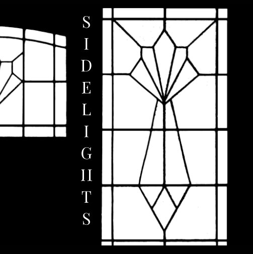
Of course, once I'd completed my first "layflat" book, I immediately started another one. This one is called Sidelights.

As well as its visual and metaphorical sense of "lit from the side, or a tangential insight" a sidelight, in British usage, is a window located to the side of something, typically a door. As opposed to a fanlight (or "transom" in US usage), which goes above the door. We live in a typical 1930s semi-detached house, with an elaborate part-glazed front door and sidelights made up of leaded panes of various types of pebbled glass, in a vaguely Art Deco sort of pattern. You see street upon street of such arrangements in all of the older city suburbs, generally in combination with a porch. Some are very fancy indeed, especially the Victorian ones using stained glass, and more often than not each house in the street has a different design; glaziers must have been coining it in those days. As our house faces south-east, the morning sun shines directly through this glass frontage, so it has become a very familiar set of shapes over the years: on a bright morning, the lattice of lead cames is practically burned onto your retina as you come downstairs.

A few years ago, I abstracted the lead skeleton of the three lights and the silhouette of the door and wooden side panels from a photograph and began a series of photo-collages, in which various textures and views were combined to differing degrees of effectiveness and incongruity. It was fun to do: you just dropped a new photograph into either the black "positive" or the white "negative" shapes to see what would happen. The results seemed to say something about "inside" versus "outside", the domestic versus the urban environment, and so on. But in the end it came to feel like a rather formal exercise and, as with the triptychs, the wide, narrow shape was not really suitable for a book. Given they really needed to be seen as a series for the point to come across, it therefore seemed like a highly personal project without much purpose.


Then layflat came "over the transom", so to speak. When I remembered these window pattern pictures they seemed like an obvious match. A small square (7") book seemed about right, opening up to show a little series of twelve 11.5" x 5.75" images. Their bilateral symmetry is emphasised by the central fold, and it's always interesting when form and function coincide like this, unobtrusively but effectively. In Trine, that first layflat book, the central fold, even if barely noticeable compared with a conventional binding, served no real aesthetic purpose. If it could not have been there, that would not have been a problem: nobody really wants to fold a picture down the middle, and it's hard to imagine many projects involving wide pictures where that would not be the case. The issue that layflat binding addresses is the pronounced gutter of a "perfect" glued binding, mainly because some of any image spread across it is necessarily invisible, but also because the unpredictable trimming of adjacent pages can often lead to a vertical offset between its two halves. Then there's also the risk of the book breaking apart, if flattened out too forcefully. So "layflat" is a good solution, although I think I'd prefer a proper panoramic book format or even some kind of leporello (accordion-fold) option; that last would be immensely popular, I'm sure, even if pricier than layflat. But with Sidelights the flat central fold is quite effective, and makes for a pleasing little book.

Here's the Blurb preview, see if you agree:
As with Trine, the hard copy is very expensive, but the PDF is very cheap [1]. I'm also going to distribute copies of the Sidelights PDF on CD myself, in a clear plastic sleeve with a printed paper insert. If you'd like one (£5.00 + £2.50 p&p, anywhere in the world), email me (address in "View My Complete Profile" at top right). It looks like this:


Speaking of "anywhere in the world", although most of my readers are in the USA or Europe, for some time Google Analytics has been showing me some very regular visitors from Australia and New Zealand, mainly from Canberra, Melbourne, and Auckland. As far as I know, none of you has ever commented (which is fine, obviously) but it would nice to know whether I have some real readers "down under", or just some persistent, robotic, antipodean hangers-on. A brief comment or a private email would be very welcome.


1. If you do buy one, the usual Acrobat viewing recommendations apply, except for "show gaps between pages" i.e. under the menu "View" / "Page Display" choose both of  "Two Page View" and "Show Cover Page in Two Page View" BUT ensure that "Show Gaps Between Pages" is NOT selected.

Sunday, 21 July 2019

Moonstruck


You may not have realised this, but this week has marked the 50th anniversary of Apollo 11's voyage to the Moon and back. Today, in fact, is the very day on which we, humanity, left our very first beer cans on the Moon. What, you already knew?

I'm being facetious, of course. Eddie Mair, when he hosted BBC Radio 4's PM programme, had a running gag, in which, at any opportunity, he would play that crackly clip of Buzz Lightyear's fumbled lunar soundbite. You know the one: That's one small step... um... It became profoundly annoying, and listeners had to beg him to stop. He must be getting a taste of his own medicine at the moment. For an entire week, it has seemed like every radio programme, every news bulletin, every drama, every trailer for every programme, etc., has been featuring the Moon landing, all using the exact same set of clips. You'd have thought a little editorial co-ordination would have been applied: People, people, you can't ALL do the fucking Moon, not all week!

As with the Kennedy assassinations, I was there, so to speak, but similarly can't recall a thing about it. On Monday July 21st 1969 I was 15 years old, starting what I'd guess was the last week of my last term in the fourth year of my recently comprehensivized grammar school. My partner says that at her London girls' grammar they watched the broadcast recordings on TV that day in the school science lab, but I have no such memory. I'm not even sure our school had a TV, or where it was kept, if we did. Although, of course, those Historic Moments have been replayed so frequently over the past 50 years that, like various Motown chart-toppers, I couldn't now say with any certainty when I really first encountered them. That's one small step... um... I'm pretty sure, though, that the whole thing got less media coverage back then than it has had in the past week.

W.H. Auden published a grumpy poem, "Moon Landing", in the New Yorker of September 6th 1969. It's not one of his best, but includes these lines:
We were always adroiter
with objects than lives, and more facile
at courage than kindness: from the moment
the first flint was flaked this landing was merely
a matter of time. But our selves, like Adam’s,
still don’t fit us exactly, modern
only in this—our lack of decorum.
Homer’s heroes were certainly no braver
than our Trio, but more fortunate: Hector
was excused the insult of having
his valor covered by television.
Do I detect a discreet echo of "Hogan's Heroes" in there? Probably not, but I like the idea of Wystan settling down for a chuckle at the antics of Sergeant Schultz after a hard day's prosody. However, there must surely be a bit of a borrowing from the extraordinary opening sequence of 2001: A Space Odyssey, released in 1968, in "from the moment / the first flint was flaked this landing was merely /a matter of time". Talking of Stanley Kubrick and Apollo 11, conspiracy theory aficionados may enjoy this article, "How Stanley Kubrick Staged the Moon Landing" by Rich Cohen, in the Paris Review.

But, from my point of view, there was simply a lot more significant action going on that year. A little thing like a moon landing is easy to forget, and I seriously doubt I gave it a second thought, once school was out for the summer. After all, 1969 was the year the three best Fairport Convention albums were released, not to mention the first two Led Zeppelin albums, and July 20th was the very week "Honky Tonk Women" by the Rolling Stones topped the UK singles chart. That Easter I had learned to drink like a Rhinelander, and in the summer to come, would have my very first holiday romance, by the very romantic shores of Lake Como in Northern Italy. Life was kicking off, and the Moon, as it turned out, is deader than dead.

Besides, the whole point of the Moon, surely, is to be gazed at from down here, and not trampled over by Homeric oafs in space suits, armed with golf clubs and scripted platitudes. In Auden's words, "Worth going to see? I can well believe it./ Worth seeing? Mneh!"[1] Although, clearly, the one true prize and spectacle – the thing that inadvertently justified the whole enterprise, the single spin-off that everyone acknowledges as priceless – was not non-stick frying pans or scratch-resistant lenses, but the simple sight of our fertile blue planet floating vulnerably in an infinity of black space, as seen from the sterile, dusty plains of the Moon.

Meanwhile, back on Earth:
Full Moon and Little Frieda
A cool small evening shrunk to a dog bark and the clank of a
                                                                               bucket—

And you listening.
A spider's web, tense for the dew's touch.
A pail lifted, still and brimming—mirror
To tempt a first star to a tremor.

Cows are going home in the lane there, looping the hedges
  with their warm wreaths of breath—
A dark river of blood, many boulders,
Balancing unspilled milk.

'Moon!' you cry suddenly, 'Moon!  Moon!'

The moon has stepped back like an artist gazing amazed at a work
That points at him amazed.
Ted Hughes (1967)
Now, that's a poem.


1. Some people seem to regard this as a first appearance in print of "meh". I disagree: if you say it aloud, this is surely not a noise of ambivalence, but a streetwise and sarcastic version of "nah!", isn't it? Closer to "you gotta be kidding me!", than "maybe, kinda, sorta".

Friday, 19 July 2019

The Horseman's Word


The lower depths of my mind increasingly resemble a scrapyard, littered with the unused parts, offcuts, and scraps of finished and abandoned projects, intentions, and ambitions. I suppose it's the same for everyone, after the inevitable decluttering of midlife, although it does seem that most of us are able to go the extra step, and somehow manage periodically to jettison the junk. I, however, haven't (or can't, or won't). I like junk too much; there are few simple pleasures as acute as finding a new use for some old, half-forgotten cast-off, or even just rummaging through a mental drawer, looking for one thing and finding another, even better thing.

I suspect this may go back to my childhood. My father was a top-notch mechanic and bodger – necessary skills of self-reliance learned as a despatch rider, navigating solo to vaguely-defined, mobile destinations on a motorbike or truck in wartime France, the Western Desert, and Burma – and he took pride in maintaining and repairing our family car. I would often accompany him to Jack's Hill, a breaker's yard just outside town, where scrapped vehicles and components lay quietly rusting in tall, rough-sorted heaps. Somewhere in there would be just the right part for the job. All that was needed was patience, luck, and a good eye.

I've talked about the usefulness of a well-stocked mental cellar before, and the role of subconscious mechanisms in fetching up just the right thing at the right time (De Profundis). I've learned to trust my impulses. For example, when photographing in various natural history collections in recent years, I would often find myself unaccountably attracted to the skeletal remains of frogs. Surrounded by the grandeur of dinosaurs and other spectacular creatures, this may have seemed odd, but when the "subconcious alert" light goes on, I know to simply do what I'm told. It was only recently that I came to realise why it was that frog skeletons, of all things, had been triggering the warning light.


Among many might-have-beens that have left their wreckage in the mnemonic midden are various unwritten novels. Like most people with a liking for reading, a facility with writing, and imaginative tendencies, I'd always assumed I'd probably get around, sooner or later, to writing at least a few of the stories that have been fermenting in my head for decades. It's taken me a long time to concede the simple truth that a writer is a person who writes, and a novelist is a person who writes novels. A person who merely thinks about writing novels, however intensely, is a daydreamer. Writing this blog is about as far as my writing career is likely to go. My real, actual, creative accomplishment, such as it is, is entirely visual.

But, as many practising novelists have confirmed, doing the preliminary research is more than half the fun, and I've enjoyed doing a fair bit of that over the years, filling out the background of imagined scenarios that might have become something more substantial, if I'd only sat down and actually started writing. One such scenario involved the horsemen of East Anglia who, in the days when heavy horses were the all-purpose engines of farming, formed a secretive elite among agricultural labourers – sometimes known as the Horseman's Word – that, in effect, was a secret society, fraternal guild, apprenticeship scheme, and trade union rolled into one. Their skill at handling those magnificent beasts was legendary, and to the outsider this skill could look rather like magic. Indeed, a certain amount of hocus pocus was used to protect and conceal the tricks of the trade: it did no harm to be regarded as the exclusive possessors of special powers.

Inevitably, others have by now written horse-handling novels. I suppose I should read The Horseman's Word by Roger Garfitt, but probably won't; it is on my Kindle, but so are many other unread impulse downloads. More interesting are the various factual books published on the subject. For example, George Ewart Evans, the folklorist and agricultural historian of East Anglia, wrote Horse Power and Magic (Faber, 1979), which gives a fairly down-to-earth account of the place of the horsemen on the farms of Norfolk and Suffolk. More recently, Russell Lyon wrote The Quest for the Original Horse Whisperers (Luath Press, 2003), which gives some very detailed accounts of the sort of practices that accompanied the breaking of horses, breeding, foaling, and the many bits of practical "magic" that could bend a working team of powerful horses to the handler's will. All of which would make for a finely detailed, if dull, story of life on the farm in the years before steam engines and tractors began to replace 'eavy 'osses. But what fascinated me was that element of hocus pocus, and in particular the ritual that was said to enable a man to attain a whole new level of power over his equine charges.

Rather like Robert Johnson's midnight tryst at the crossroads that was alleged to have given him exceptional ability with the guitar, certain horsemen were said to have "been to the river", and thereby acquired an ability to control horses that defied explanation, even by other skilled horsemen. The details of the ritual involved vary, but the essence of it required the capture and killing of a toad, which was then hung from a bush or pegged on an anthill until all the flesh had been picked clean. The bones were then carried about in a pocket or a bag until fully dried out. Then, on a full moon at midnight (when else?), the bones were carefully floated in a stream: all except one would be swept away by the current. The possession of that remaining, fork-shaped bone supposedly granted its owner an uncanny level of control over horses. He had been to the river, and become a "toadsman" [1].


So, typically, something I had forgotten all about but never discarded has been resurrecting itself at the opportune moment: just the right bits emerging at just the right time from the scrapheap in order to start off something new. If it's a book, it will be a book of pictures, of course, and certainly not a book of words. At least, not primarily; a combination could work quite well, not least for anyone for whom the connection between horses and amphibians is less than obvious. Sadly, as with the wasps, I don't anticipate many people wanting to hang batrachian-themed pictures on their walls. Big, beautiful horses and old boys in flat caps and waistcoats, maybe; skeletal, spectral frogs and toads, not so much. They're cold, ugly things, even fully clothed, with a certain uncanny menace about them; I'll never forget my mother's shriek when one popped up underfoot in the coal bunker one dark night. Although it has to be said that newts do have a certain sleek charm. It's a shame the horsemen had no known use for them. Or, who knows, maybe they did...

1. A more likely scenario, of course, is that this is the equivalent of an engineering apprentice being sent on a hunt for a left-handed spanner. Having been persuaded to go about this fiddly bit of witchery, the candidate surely ends up spilling the lot into the water in the darkness, at which point the other toadsmen spring from concealment, pull down his breeches, and smear his nether parts with horse dung, or some other initiatory humiliation. He is then catechized, congratulated, and sworn to secrecy ("The first rule of Toad Club..."), then handed his symbolic toad's bone, and a copy of The Book of the Toadfolk, containing many cunning recipes and horse-handling techniques.

Friday, 12 July 2019

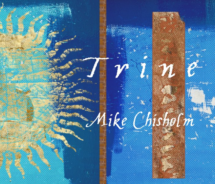
Trine


For some time now I've been meaning to try out the "layflat" binding that Blurb and others now offer, but it has always seemed an excessively expensive option to me, and not really suited to any of my book projects. The main point of "layflat" is that an image can be spread across two adjacent pages, and the book opened completely flat to view the two-page spread without risking damage to the binding, not unlike the block-books made for very young children. Nice, but ultimately pointless, unless you've got a good reason (other than perversity) to place a picture across two pages. In a conventional binding, of course, this common but doltish design practice means a good chunk of the image is lost in the "gutter" between pages, in a classic triumph of style over sense and practicality.

But for quite a long time I've been making long, "panoramic" photo-collages, often broken up into chunks of three as triptychs, which wouldn't fit comfortably into any normal book size without excessive miniaturisation. So, in an idle moment, I started to lay up a layflat 10" x 8" book in landscape format, spreading these triptychs across two sides. The fit was perfect, and as a project it made complete sense; apart from the potential cost, that is. From Blurb, a regular, 20-page, 10" x 8" hardback on premium paper costs about £25, which is not exactly cheap; the layflat version of the same book would cost nearer £50. Ouch. But it was looking quite good, so I carried on, anyway (in, ah, a classic triumph of style over sense and practicality), adding and refining, until I had something that might possibly be worth that kind of outlay. To me, anyway, if only as a sample of what might be done. The result was Trine.


A "trine" can simply be a group of three things or, as an adjective, something which is threefold. But the word's main usage is in astrology. The twelve signs in the zodiac are arranged in a circle, in three groups of four, each group containing one sign each of the four elements (fire, earth, air, and water). If two planets are located within two signs sharing the same element, then the angle or "aspect" connecting them is roughly a third of the circle, and this is known as a "trine aspect". Because signs with the same element are supposed to have much in common, the "forces" within them are thought to work together particularly well when connected in a trine aspect. The more so, the closer the angle between the planets comes to exactly 120° (its "orb").

Heh. I must admit, I do admire the way astrology brings such complexity, mathematical precision, and vivid vocabulary to what, in any rational view, must surely be utter nonsense. In that regard it is not unlike, say, psychoanalysis: a wonderful game to play between two consenting adults, with strict but imaginary rules, and yet sometimes surprisingly effective results. I suppose astrology is the sort of package you were bound to get at a stage in human history when mathematics and geometry had developed far in advance of any other science, and there was a huge, unsatisfied craving for the universe to be imbued with meaning. The discovery of the orderliness and predictability of the night sky must have seemed like an enormous clue, mustn't it? "Look, your magnificence, me and some of the other serfs have spotted some patterns, like, up there that seem to affect what goes on down here and, best of all, I reckon we can put some numbers on it all!" "Really? Then put those spears and spades down, lads, come inside, clean up, and get to work... Now, you'll be needing some kind of special hat... The Royal Canteen is over there... How would your good lady serf feel about a few labour-saving devices – slaves, servants, cooks, concubines, that sort of thing?" Result!

Anyway, here is a link to the preview of the book, which has no occult meaning that I can discern:
Given the thing is so expensive in hard copy, I make the usual recommendation to buy the much cheaper PDF [1]. Or you may be interested to learn that I have decided to distribute the PDF myself on a CD, produced and printed by me in a transparent sleeve with a paper insert, something I may start doing for all my books. I like CDs: they are cheap, easy to package and customise, a nice compromise between permanence and ephemerality, and take up so little house-room. It's a shame fewer and fewer people seem to feel the need for a CD/DVD drive these days. But if you would like a copy for £5.00 plus a nominal £2.50 p&p, anywhere in the world, email me (see "View My Complete Profile" at top right for my address).


And here, by the way, is my very own birth chart, as drawn up by a professional astrologer. Or by his computer software, at any rate. Aquarius with Scorpio rising, and Moon in Taurus, since you ask. It's all in there, for those with eyes to see, and a large measure of respect for finely-calibrated BS! [2] And check out that rather rare unaspected Jupiter... It seems I was destined to be me, which is perhaps not as daft as it sounds.


1. In which case, the usual Acrobat viewing recommendations apply, except for "show gaps between pages" i.e. under the menu "View" / "Page Display" choose both of  "Two Page View" and "Show Cover Page in Two Page View" BUT ensure that "Show Gaps Between Pages" is NOT selected. Also, I haven't yet seen the hard copy yet myself: they have to be made in the USA, then shipped to the UK, which is s-l-o-w.
2. Part of me wishes I could say any interpretation of this natal chart was nonsense. However, I have had two done, now, and both are actually spookily accurate. I have no idea why or how this should be the case; sheer luck? Has anyone else had experience of this? Unfortunately, knowing the time of one's birth is crucial, and this is not recorded on UK certificates, except in the case of twins. Luckily, I had already asked my parents for this information many years ago.

Friday, 5 July 2019

Fair Exchange

Apparently – at least, according to a recent spot on BBC Radio 4's PM programme – school foreign exchanges are in decline, partly through concerns about health and safety, but mainly, it would seem, due to the shameful decline in the teaching of languages in British schools. A lifetime ago, when I first became an academic librarian, a command of two modern European languages was regarded as a reasonable minimum entry requirement. At my typical, small-town, state grammar school, we had all routinely studied Latin, French and either German or Spanish to what was then "O" level at age 16, and in the Sixth Form could even choose to learn a little Russian rather than endure "General Studies". How things have changed: my own children, at their Southampton state schools, only had the opportunity to study one language, fairly badly taught and with little attention to grammar, vocabulary, or oral competence, and certainly without the reinforcement of spending a few weeks living abroad with the family of a "partner" student at some lycée or Gymnasium in a twinned town. By the time I retired in 2014, we could barely recruit graduate-level staff with more than a very basic smattering of either French or, more usually, Spanish. As I say, shameful.

On the BBC radio discussion, the two guests were asked about how they had got on being housed by a family in France and Germany, respectively. One was positive – she had gone on to be a BBC correspondent in Germany – the other hilariously negative, with tales of miserable isolation in some remote and inhospitable French farm. Their stories brought back a flood of memories of my own exchange experiences. Our school actually ran two exchange programmes, one to Versailles and the other to Ingelheim am Rhein, a wine-growing area of the Rhineland and home to the Boehringer pharmaceutical giant, not far from Mainz, and although I never did do the French exchange – neither was free, and I don't think we could afford to do both – I did do two exchange rounds with my German "partner" and his family.

The way it worked was that during the Easter holiday your family would host your partner, and then in the following year you would stay with his family; it was, in effect, a four-year relationship. There was some pretence of matching students by criteria of compatibility, but essentially it was a random process, accompanied by some penpal-style correspondence. I ended up being paired with a strapping, sports-mad, not especially academic lad called Achim, whose family ran and lived above a small Spar grocery. I suspect the fact that we both lived in flats – untypical in both towns – was the main factor in our match-making. Otherwise, we had essentially nothing whatsoever in common, something that only became more apparent as the years progressed and our developing personalities diverged still further. We made a success of it, however, like any marriage of convenience, by going our separate ways during the day and, in the final years, in the evenings, too.

Despite our incompatibility those were vivid times, the weeks I spent in Ingelheim. The first year away – 1969, when I was 15 – I encountered the casual Rhineland-German attitude to alcohol consumption within the family. Now, I wouldn't say my parents were teetotal, but "drinking" was for special occasions only, and even then in moderation, and it would never have occurred to them to open a bottle of wine or two habitually with a weekday meal. Achim must have found this odd. His family's habits were very different and, living above the shop, had what amounted to a bottomless cellar of supplies to draw on. Consequently, wine and beer flowed freely at most mealtimes. Several times I became embarrassingly drunk, said and did things that provoked hilarity, and later found myself having been put to bed with a bucket tucked underneath my arm. I was taught to recite, Bier auf Wein, lass es sein! Wein auf Bier, das rat ich dir! [1]. There was no sense of blame, shame, or recrimination: we had a good time last night, nicht wahr? [2]. Although, it's true, other families could be rather less easy-going, especially if the drunkenness was not home-brewed, so to speak.

Another striking thing was the relative prosperity of West German life. My home town, Stevenage, as I have often described before, was and is an essentially working-class, post-war New Town development, artificially populated in the 1950s with young families escaping from the poorer parts of London. Economically, historically, and culturally it was a "thin" place, despite the pervasive sense of optimism: we felt fortunate, but didn't know how little we actually had, or how precarious it all might prove to be, with a change in the political wind. The English middle-classes didn't live in places like Stevenage, although some of their children were bussed in to our school from the surrounding leafy villages. Ingelheim, by contrast, was a prosperous and historic little town, typical of the post-war West German Wirtschaftswunder. It was the everyday things that were so striking: the utility cellars in most houses with an array of freezers, washing machines, tumble-dryers; the giant tubs of washing-powder and other bulk-bought household goods; the sheer quality and quantity of the food and drink in its attractively-designed, modern packaging. Most of us had never encountered simple, life-enhancing things like bottles of apple-juice, served cold from the fridge, a schnitzel and fries with a half litre of beer in the local hostelry, or real artisanal ice-cream.

But it was the parties I remember most. Other schools had exchange arrangements with Ingelheim, including our own town's girls' grammar school, but the timing of their exchange visits was often – quite possibly deliberately – different. However, like some rare conjunction of the planets, on our 1971 visit we, the girls' grammar, and a French lycée all found ourselves thrown together, aged 17, at raucous parties in large, bourgeois houses where music, drink, and congenial company combined in a heady, and occasionally explosive mix. A couple of years ago, I dug a favourite old jacket out of a wardrobe as a potential measure of my desire to lose weight. Some men gauge themselves against their wedding suit: absurdly, perhaps, I set myself the rather more extreme target of fitting the jacket I wore in Ingelheim in 1971, and on many subsequent youthful adventures. In the inner pocket, I found a slip of paper with the handwritten address and phone number of a French girl with whom I had had a brief, intense, but long-forgotten encounter at one of those parties, 45 years ago. I found it oddly moving; in those pre-internet, pre-mobile days, an exchange of pieces of paper like that was all there was, the only meaningful gesture you could make. Should you ever find yourself in Autun...

And yet, here we are – with the distances between us shrunk to virtually nothing by means of communication easier, faster, and cheaper than anything we could ever have imagined in 1971 – on the brink of turning our backs on the European project our French and German friends have put so much effort into building, as well as abandoning the teaching of foreign languages in our schools, and even, apparently, equably contemplating the break-up of the union with Scotland, Wales, and Northern Ireland, all in pursuit of some swivel-eyed, isolationist vision of national sovereignty. Brexit at any cost! No wonder school exchanges are dying out. But the real visionaries were the ones who saw, after so much bloody conflict in Europe, that the best route to peaceful and prosperous co-existence was simply to let young people get to know each other by spending time in each others' homes, even if that did mean sometimes being imprisoned in a hostile French farm miles from nowhere, or dizzily put to bed with a bucket under your arm.

1. Literally, "beer on wine, leave it alone! Wine on beer, that's my advice to you!" There are English equivalent rhymes, none of which is quite so infallibly memorable in the relevant circumstances.
2. "Not so?" or "didn't we?" Actually, more likely than nicht wahr?, it would have been gell? or oder?  It's precisely that sort of informal, everyday usage you can only pick up "in country", and why exchanges are such a good thing. You acquire the conversational "glue" that enables you to mumble platitudes like a native.

Sunday, 30 June 2019

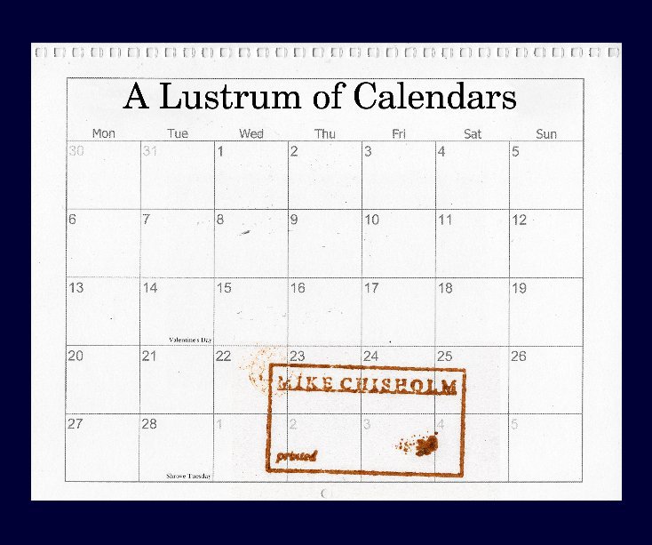
A Lustrum of Calendars


Towards the end of every year since 2010 I have produced a small number of copies of a simple, spiral-bound A4 calendar featuring my own artwork, for distribution as a Christmas / New Year gift for close friends, family, and my more esteemed co-workers. The numbers in those categories were never exactly large, and are inevitably declining these days, so the costs involved in this largesse have always been manageable. Nonetheless, the standard of art reproduction I choose is quite high (I use and recommend Vistaprint) so each calendar constitutes a nice little portfolio of some of the better work I have produced in the preceding year for its recipients to contemplate or ignore as they go about planning their daily lives. If nothing else, it's a nice way to be present in the domestic environment of some people I never get to see often enough.


It occurred to me that – calendars being essentially ephemeral objects – it might be worth putting together a book to record a few of them. The five-year run from 2014 to 2018 – the "lustrum" when I seemed to hit my calendrical stride most convincingly – seemed about right. It then also seemed like it would be an even more interesting idea to pair the calendar image for each month (on the right) with a photograph taken by me during that particular month of that actual year (on the left). A calendar picture is a curious kind of speculative gamble: you pick an image for, say, June in the coming year, without any idea at all of what those few weeks in the future will be like in the various lives and situations of those who (you hope) will be looking at and living with that picture for the duration of that month.

One copy, for example, always hangs in the toilet of a stained-glass workshop in the Dordogne (for purposes of better contemplation, alleges its recipient), while another is in a kitchen in the far north-east of Scotland, on the Beauly Firth just outside Inverness. By pairing the two pictures, perhaps the book could give some hint of how each month in each of those five consecutive years did turn out for me, even if only as captured in a single photograph. I thought it would also be curious to see how often there might or might not be a connection of some sort to be made between the two images, the one as prophesy and the other as actuality.


Unsurprisingly, this produced quite a big book of 134 pages, which in hard copy is inevitably also an expensive book. I've really only produced it for my own amusement, however, and don't seriously expect anyone else to buy a copy (do I say that every time I make a book? I might as well...). In fact, I've ended up making myself two versions. Initially, I used the "standard landscape" 10" x 8" format, but then Blurb launched another of their (worryingly frequent) "40% off" promotions, so I thought, "in for a penny...", and enlarged the whole thing into the grand, "large format landscape" version at 13" x 11". It will look good on the shelf... However, as usual, the Blurb PDF is ludicrously cheap, and I'd encourage you to take a look at the book preview below and, if you like it, to buy yourself a copy of that. Bear in mind that – again, as usual – I will actually make as much profit from those PDF sales as from any book sales.

If you do buy a PDF, it is especially important that you set your PDF viewer (typically Acrobat) so that you are seeing a two-page view with a separate cover page, ensuring that the correct pages face each other. In Acrobat the settings are:

Under the menu "View" / "Page Display" choose all of:
"Two Page View"
"Show Gaps Between Pages"
"Show Cover Page in Two Page View"

Here is the Blurb preview:
I can't believe it's the end of June already...