

Of course, once I'd completed my first "layflat" book, I immediately started another one. This one is called Sidelights.
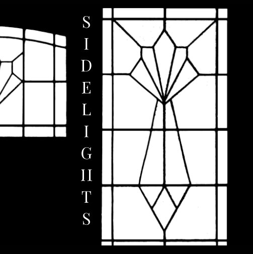
As well as its visual and metaphorical sense of "lit from the side, or a tangential insight" a sidelight, in British usage, is a window located to the side of something, typically a door. As opposed to a fanlight (or "transom" in US usage), which goes above the door. We live in a typical 1930s semi-detached house, with an elaborate part-glazed front door and sidelights made up of leaded panes of various types of pebbled glass, in a vaguely Art Deco sort of pattern. You see street upon street of such arrangements in all of the older city suburbs, generally in combination with a porch. Some are very fancy indeed, especially the Victorian ones using stained glass, and more often than not each house in the street has a different design; glaziers must have been coining it in those days. As our house faces south-east, the morning sun shines directly through this glass frontage, so it has become a very familiar set of shapes over the years: on a bright morning, the lattice of lead cames is practically burned onto your retina as you come downstairs.
A few years ago, I abstracted the lead skeleton of the three lights and the silhouette of the door and wooden side panels from a photograph and began a series of photo-collages, in which various textures and views were combined to differing degrees of effectiveness and incongruity. It was fun to do: you just dropped a new photograph into either the black "positive" or the white "negative" shapes to see what would happen. The results seemed to say something about "inside" versus "outside", the domestic versus the urban environment, and so on. But in the end it came to feel like a rather formal exercise and, as with the triptychs, the wide, narrow shape was not really suitable for a book. Given they really needed to be seen as a series for the point to come across, it therefore seemed like a highly personal project without much purpose.


Then layflat came "over the transom", so to speak. When I remembered these window pattern pictures they seemed like an obvious match. A small square (7") book seemed about right, opening up to show a little series of twelve 11.5" x 5.75" images. Their bilateral symmetry is emphasised by the central fold, and it's always interesting when form and function coincide like this, unobtrusively but effectively. In Trine, that first layflat book, the central fold, even if barely noticeable compared with a conventional binding, served no real aesthetic purpose. If it could not have been there, that would not have been a problem: nobody really wants to fold a picture down the middle, and it's hard to imagine many projects involving wide pictures where that would not be the case. The issue that layflat binding addresses is the pronounced gutter of a "perfect" glued binding, mainly because some of any image spread across it is necessarily invisible, but also because the unpredictable trimming of adjacent pages can often lead to a vertical offset between its two halves. Then there's also the risk of the book breaking apart, if flattened out too forcefully. So "layflat" is a good solution, although I think I'd prefer a proper panoramic book format or even some kind of leporello (accordion-fold) option; that last would be immensely popular, I'm sure, even if pricier than layflat. But with Sidelights the flat central fold is quite effective, and makes for a pleasing little book.
Here's the Blurb preview, see if you agree:

Speaking of "anywhere in the world", although most of my readers are in the USA or Europe, for some time Google Analytics has been showing me some very regular visitors from Australia and New Zealand, mainly from Canberra, Melbourne, and Auckland. As far as I know, none of you has ever commented (which is fine, obviously) but it would nice to know whether I have some real readers "down under", or just some persistent, robotic, antipodean hangers-on. A brief comment or a private email would be very welcome.

1. If you do buy one, the usual Acrobat viewing recommendations apply, except for "show gaps between pages" i.e. under the menu "View" / "Page Display" choose both of "Two Page View" and "Show Cover Page in Two Page View" BUT ensure that "Show Gaps Between Pages" is NOT selected.

No comments:
Post a Comment