Saturday, 16 May 2020

Four by Four by Four


Making paired pages is easy enough. It's quite fun, too. As you repeatedly scan through a large collection of images (well over 600 in this case) you gradually acquire a deepening awareness of them: an intimacy that is very different from familiarity. Echoes, affinities, and contrasts start to emerge, and an organic sense of their interconnections begins to grow. What starts as a simple matching process – "this one looks like that one" – gradually becomes something less mechanical: this one does obviously go with that one, but – wait! – it has a more interesting resonance with that other one, and this one really makes that first one sing, and so on, and so on. As a way to pass the time during a lockdown, it's hard to beat; a sort of open-ended, improvisational game of Patience.

One slightly uncanny phenomenon that I have been noticing is that a filename-sort of the items in the directory of "selected" items often brings good potential pairings together, side by side – quite often photographs taken in different years with different cameras. Wooo! I have no explanation for this, other than it's possible that proximity may induce affinity, entirely in the viewer's mind. We are connection-making creatures, after all. On the other hand, these pictures generally only become neighbours in the sort when the intervening deadwood has been cleared away. It's strange.


However, I find that the next step, sorting them into a book sequence, is neither easy nor fun. It requires a different level of effort and commitment, and a certain amount of projection into the mind of a potential reader. Will they be bored by too many pairs in the same orientation ("portrait" vs. "landscape") in a row? Are "mixed" pairs (portrait plus landscape) more or less satisfying to the eye? Which are the five-star pairings, and where should they be deployed? Should some single images, and perhaps even some texts be included to break things up a bit? And at what point will I realise that creating Kodachrome 2.0 is a silly idea and that I should be going my own way? These are not essentially photographic or aesthetic considerations, but may be the most important choices, if the final book is to be a success as a book.


To help with this task, I have been creating and printing out A3+ sheets (13" x 19") onto which a four by four grid of dummy page-spreads has been arranged. My intention is to cut these up into individual spreads, if only to disrupt that curious "proximity breeds affinity" phenomenon, but I must admit I do quite like the way they look, unsorted and uncut. This may simply be because a simultaneous, poster-style view of multiple images is a way of avoiding the hard work of deciding on a single, serial, book-style presentation. Perhaps some kind of random ordering process will give the best of both worlds?

So far, I have filled four and a half sheets, which will be a book of around 150 pages unless some further selection is applied. As ever, the choice is between creating something substantial and something affordable. Given no-one will buy the thing, anyway, I suppose it might as well be substantial. Perhaps even a sixth sheet would not be excessive...


Thursday, 14 May 2020

Not So Fast, English...


Another "Postcards" dummy spread

In the recent post Postcards 4 I had a little snarky fun at the expense of the introduction to Luigi Ghirri's Kodachrome, a book which is otherwise Holy Writ to me. As I suggested there, this was a very Anglo-Saxon response to the sort of involuted linguistic constructions that characterise "continental" philosophising in general. Even better, the translation was truly awful, and what is more amusing than the stumblings of non-native speakers? Hey, listen, I've tried speaking French in Paris and German in Berlin, not to mention Russian in St. Petersburg and Spanish in Barcelona, and my cheeks still burn with the humiliation. Yeah, yeah, very funny... Wait until you visit London, mate.

Nonetheless, as a person whose self-regard rests largely on a capacity for understanding language, in all its abused, elevated, or hyperventilated states, I dislike failing to understand a piece of writing that is clearly intended to be enlightening. So, let's give it another go. What was Piero Berengo Gardin really trying to say?

Now, even the best translations are fraught with cross-cultural misunderstandings, and simple errors. A couple of years ago, for example, as described in the post Gigantic Arabs, I found that the translator of some letters published in 1908 had mistaken "arbres" (trees) for "arabes" (arabs), resulting in the curiously Freudian sentence, "So there is nothing to do but deplore my sex and return to dreams of Italy and Spain. Granada! Gigantic Arabs, pure sky, brooks, rose laurels, sun, shadow, peace, calm, harmony, and poetry!" And let's not revisit the ill-feeling that certain attempts to translate that exhortation of George Clinton of Funkadelic, "free your mind, and your ass will follow", caused at my Innsbruck residency (see Lost in Translation). Let's accept that translation is hard, and see what can be done about it.

So, for the non-bilingual, the key to understanding poor translation is the bilingual dictionary. Not in the obvious sense that you can look up unknown words, but in the sense that you can reverse-engineer someone else's shoddy work, by finding the linguistic "false friends" and simple errors that may have led them down strange paths, when they looked something up in the dictionary (or, more likely, didn't).

Here are the two translated passages [1] from the introduction to Kodachrome that I quoted:
The elements composing the work are a large quantity of communication data and a large quantity of ambiguity. While the communication data are direct and immediate, the ones of the ambiguity are mediate by the presence of a very important element: the time going by and its progressive consumption till the limit point of the image congealment and its cancellation.
And:
The Author, paging its picture-cards lets a large white space around the image. To all people asking the reason of a so algid, iconographical isolation I answer, in agreement with the Author, that the photograph has been deprived of a superfluos [sic] space. I mean the one where it is collected and filed the direct, explicit datum. The subtraction of this space is so corresponding to the cancellation of any possible presumption of truth.
Hmm. My Italian is poor, but I know enough to make a close comparison and, more importantly, I know enough Artspeak to penetrate Berengo Gardin's intentions, bearing in mind this was written in 1978, when even God was still scratching his head over the latest issue of Tel Quel. For a start, one very basic word that occurs frequently is cartolina, translated as "picture-card". Well, I think we already know what a cartolina is: it's a postcard! Which, if nothing else, suggests my own "postcards" project is on the right track. But what about "congealment"? In English, the verb "to congeal" has a quite specific meaning, and some unpleasant associations: it's what blood does as it dries, or fatty food does as it cools and sticks to the pan. It's not a word you associate with photographs (unless, I suppose, you're a wet-plate fanatic). So what, according to the dictionary, does congelamento actually mean? It seems it means "freezing". Aha! We have uncovered a "false friend"! Similarly, consumazione does not mean "consumption" (consumo in Italian), but – setting aside its more common, touristic meaning of "food or drink that one orders in a public establishment" – it means "consummation" or, I suspect, something not unlike the commercial term "fulfilment". Light begins to dawn.

As well as numerous dictionaries, the Web has gifted us various indispensable linguistic tools, chief among which I'd count Google Translate and Linguee. Translate is a blunt instrument, but surprisingly effective: its rendering of these two Italian passages is pretty good, if literal, and far superior to the original published versions. [2] The advantage of Linguee is that it gives multiple real-world contexts for a word or expression, which is like having an experienced interpreter at your elbow. As in English, it seems congelamento (freezing) and immagine (image) frequently occur together: it's what happens when you're watching a streamed video, for example: the picture freezes. More light!

But: to paraphrase the Incredible String Band's Hedgehog Song, we may know all the words, and have sung all the notes, but what in the name of Roland Barthes does it all mean?

I think this starts to become clearer once you realise "cancellation" (or "deletion", "striking out", "erasure") in the first passage refers back to time, and not to the photograph. He means that of the two major elements he identifies in the work as a whole –  its visual "data" and its ambiguity – the former retains its "indexical" significance (a tree still looks like a tree) but the latter is compounded by the freezing of a moment in time. Some situation was happening in and through time in front of the camera, but – once captured or "frozen" – we no longer have the information that would tell us, unambiguously, what it was, or what it became. We have a mystery, but no plot-line.

Similarly, in the second extract, he sets up a straw man, who says, "So what's with all the white space around the postcards?" ("algid", incidentally, despite being a lazy rendering of algidois a fairly obscure technical English word, meaning "cool, chilly"). The point, he seems to be saying, is that by embodying photography's removal of "superfluous" space (that is, the omission of everything outside the picture's frame) the white space emphasises the photograph's inherent truncation from any "truth value" we might naively presume it to have. We have a stage-set, but no play.

Or something like that. These are typical early skirmishes in the Theory Wars, and an attack on "grand narratives" and such. In the late 1970s this sort of hand-waving towards profundities that might, translated into blunt Anglo-Saxon terms, seem no more than statements of the bleedin' obvious was still very much a work in progress. I know, I was there. So how far did Luigi Ghirri (l'autore) understand or endorse the verbal flights his work had stimulated? Pretty much all the way, I'd say. Ghirri himself was a thoughtful, articulate writer, with a philosophical bent. When Berengo Gardin writes, "in agreement with the Author", this is no rhetorical flourish. Ghirri's Complete Essays 1973-1991 (Mack, 2016) are well worth reading, and the book happens to contain a decent re-translation of his own foreword to Kodachrome, which includes these words:
So I am not interested in images and "decisive moments", the analysis of language in and of itself, aesthetics, the concept or all-consuming idea, the emotion of the poet, the erudite quotation, the search for a new aesthetic creed, or the use of a style. My duty is to see with clarity, and this is why I am interested in all possible functions – without separating any of them out, but taking them on as a  whole, in order to be able, from time to time, to see the hieroglyphs I have encountered and make them recognisable.
[Per questo non mi interessano: le immagini e i momenti decisivi, lo studio o l'analisi del linguaggio fine a se stesso, l'estetica, il concetto o l'idea totalizzante, l'emozione del poeta, la citazione colta, la ricerca di un nuovo credo estetico, l'uso di uno stile.
Il mio impegno è vedere con chiarezza, per questo mi interessano tutte le funzioni possibili, senza separarne nessuna, ma assumerle globalmente per potere di volta in volta, vedere e rendere riconoscibili i geroglifici incontrati.]
Which is still a little obscure, certainly, but interesting, and yet I'd go so far as to say the photographs are actually rather better than that. In fact, they would seem to contradict almost every word he has written about what he is not interested in. But, as that reluctant, recusant Anglo-Saxon D.H. Lawrence said: never trust the teller, trust the tale.

Another "Postcards" dummy spread

1. Here are the original Italian versions:

Gli elementi del lavoro sono una grande quantità di dati di comunicazione e una grande quantità di ambiguità. Mentre i dati della comunicazione sono diretti e immediati quelli dell'ambiguità sono mediati dalla presenza di un elemento importante, il passare del tempo e la sua consumazione progressiva fino al punto limite del congelamento dell'immagine o della sua cancellazione.

L'autore, impaginando le proprie cartoline lascia molto spazio bianco attorno all'immagine. A tutti coloro che si chiedono il perchè di un tale algido isolamento iconografico rispondo, d'accordo con l'autore, che alla fotografia è stato sottratto uno spazio superfluo, quello, cioè, dove si raccoglie e deposita il dato diretto, esplicito. Alla sottrazione di questo spazio corrisponde dunque la cancellatura di ogni possibile presunzione di verità.

2. Here are Google Translate's versions:

The elements of the work are a large amount of communication data and a large amount of ambiguity. While the communication data are direct and immediate those of ambiguity are mediated by the presence of an important element, the passage of time and its progressive consumption up to the limit point of the freezing of the image or its cancellation.

The author, by paginating his postcards, leaves a lot of white space around the image. To all those who wonder why such an icy iconic isolation I reply, in agreement with the author, that a superfluous space has been subtracted from photography, that is, that is, where the direct, explicit data is collected and deposited. The removal of this space therefore corresponds to the cancellation of any possible presumption of truth.
Tuesday, 12 May 2020

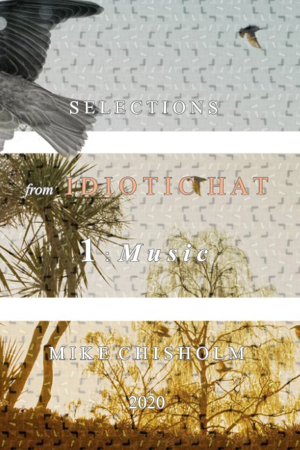
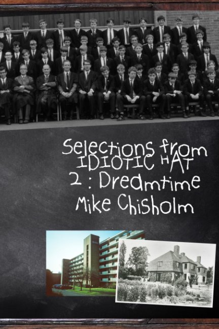
Idiotic Hat Selections 1 & 2

As I mentioned previously, I've been compiling some "best of" selections of posts from this blog, concentrating on the written rather than the visual side. There's no real need for this, obviously, given everything is sitting there online for anyone to read, but at the back of my mind I'm aware that a plug somewhere needs only to be pulled once for the whole Blogger edifice to vanish without trace. I'm also aware that nobody has the time or inclination to go back through nearly 2000 posts in someone else's blog, looking for the good bits. Blogs, after all, are like newspapers, a variety of ephemeral information and entertainment. So I'm doing the job myself. If nothing else, it's a way of ensuring that something of the effort I have put in over the years since 2008 will survive.

So far, I have produced two themed volumes. The first compiles some of the surprising number of posts I have written that touch on the subject of music, one way or another. It's a 6" x 9" (15cm x 23cm) "trade" paperback of 144 pages, printed on the cheapest black and white only paper stock. I'm afraid it's not a thing of typographical beauty, as I put most of the design effort into getting as much text onto as few pages as possible, whilst juggling the page-count to meet the mandatory "multiples of twelve" requirement (I knew learning those times-tables would pay off one day). To be honest, it does look rather like a school magazine. But one packed with good stuff!
The second selection I have called "Dreamtime", as it collects anything to do with childhood, family history, schooling, and my home town of Stevenage New Town. It is identical in format, apart from the fact it is even bigger at 156 pages.

My intention all along has been to make these cheap, and they will cost £5.49 each, which is actually less than the postage that Blurb will charge. If you would like to buy a copy, but balk at the shipping charge, do let me know by email, as I will probably have to buy a bulk batch at some point myself: most of my friends are too bloody cheap actually to buy a copy, and will mostly be expecting to receive one gratis. Luckily (?) I don't need more than two hands to count my friends.

Future volumes will probably include Art & Photography, Feeble Attempts at Humour, and The Meaning of Life. As far as possible, I will be trying to avoid duplication, so that, for example, a "humorous" post using photography to elucidate the meaning of life (and I can think of at least two) should only find itself in one of these collections. But if the page count of the "humour" volume in particular starts to look a little thin (it will need to have at least twelve pages) I'm not promising anything.

Saturday, 9 May 2020

Postcards 4


Some pairings are made in Heaven...

I've been trying out some dummy "postcard" layouts. Any resemblance to Ghirri's Kodachrome is entirely intentional. I suppose I had better use my own photographs, though... [1] I have been studying Ghirri's sequencing quite closely, and have come to the conclusion that whereas the facing-page pairings are cleverly made, and often very witty, visually, the sequencing, as such, is non-existent. Sure, sometimes one pair leads to the next – a repeated shape or motif links them together – but there is no through-sequencing beyond that mild formal linkage. At least, nothing that reveals itself to me. In the best sense, Kodachrome is a book of random associations, a strange dream conjured from the sensibility and sub-conscious of an individual with a remarkable eye for the poetry of those spaces where the "natural" and the man-made are brought into dialogue with each other. So, yes: a tough act to follow.

Others are made elsewhere...

I confess I had never before read the textual content of the book, or, if I had, I must have abandoned the attempt after a paragraph or two. In the effort to better understand Ghirri's intentions, it seemed like Piero Berengo Gardin's introduction might be a good place to start. However, I have rarely felt so impatiently Anglo-Saxon as when grappling with his impenetrable slabs of Rococo Italianate gobbledegook, poorly translated into a funhouse-mirror style of English. Sample:
The elements composing the work are a large quantity of communication data and a large quantity of ambiguity. While the communication data are direct and immediate, the ones of the ambiguity are mediate by the presence of a very important element: the time going by and its progressive consumption till the limit point of the image congealment and its cancellation.
Well, obviously. And this was especially helpful:
The Author, paging its picture-cards lets a large white space around the image. To all people asking the reason of a so algid, iconographical isolation I answer, in agreement with the Author, that the photograph has been deprived of a superfluos [sic] space. I mean the one where it is collected and filed the direct, explicit datum. The subtraction of this space is so corresponding to the cancellation of any possible presumption of truth.
I have grappled with that explanation for what seems a not especially bold design element (lots of white page?), but to no avail. I do love that final sentence, though. Truth? Pah! Va funculo! It's still a great book, though, if you stick to the pictures.

One little problem (oh, all right: challenge) is that the aspect ratios of my photographs vary quite considerably, not just between camera brands, but also depending on the shape I happened to favour at the time, not to mention the severity of any cropping. This was at its most extreme with that perfect little camera, the Panasonic LX3, which features an external dial capable of switching the picture proportions between 4:3, 3:2, and a very tempting "panoramic" 16:9, all without changing the chosen angle of view. I suppose I could crop everything into a consistent 3:2 ratio (the classic 6" x 4" postcard), or only pair up images of a similar ratio, but I'm not intending to. The difference is most obvious in "landscape" pairs, but I think this is exacerbated by the flatness of an on-screen mockup: in a real, curvy magazine held in the hand this will look less odd. Probably. So much depends on the limit point of the image congealment and its cancellation, doesn't it?

1. I think most people, these days, are aware of the story by Jorge Luis Borges, "Pierre Menard, Author of the Quixote". If not, you can read about it here. I must guard against becoming "Mike Chisholm, Author of Kodachrome"...

Thursday, 7 May 2020

Hoxton Mini Press


Some of the nicest photo-books of recent times have come from the small East London imprint, Hoxton Mini Press. In fact, their title On The Night Bus by Nick Turpin is one of my all-time favourites (I featured it in my Christmas 2016 "Book Club" post), and the more recent London Underground 1970-1980 by Mike Goldwater is a real grit-in-the-eye, air-blast of nostalgia for anyone who remembers the Tube in those days. Why, there's even a picture of the Oxford Street "Less lust from less protein" placard man [1] having a tea-break in Oxford Circus station. Their books are small, reasonably-priced, well-produced, and thematically coherent. In my view, Hoxton Mini Press is a Really Good Thing in a photo-publishing world dominated by over-priced, over-sized books containing nothing very much. However, like so many small businesses, they're in trouble now, due to the lockdown.

Consequently, co-founder Martin Usborne has launched a Kickstarter appeal to help them through this rough patch, with some some interesting rewards for backers: you can read all about it here (or see the video below). If you can afford it, I think they're well worth your support. Go on, why not?


If you're not familiar with Kickstarter, the basic idea is that the party seeking funding sets a goal and a deadline (in this case, £10K and May 20th: far too low, far too soon, IMHO [2]) and usually offers an escalating series of rewards linked to the amount of money a backer is willing to pledge. If the funding goal is met or exceeded, your pledge is paid, and you get your chosen "reward"; if not, it is void, and no money changes hands. Obviously, some Kickstarter campaigns are for startups with daft ideas and poorly-conceived business plans; this is one of the worthwhile ones.

Martin is an amusing guy, as you will see from his Kickstarter video. You won't catch Gerhard Steidl pretending to trip over a pile of stock, or keeping his awards in the office loo. The Hoxton Mini Press email newsletter has temporarily mutated into The Hoxton Corona Diaries, and is savagely funny (and includes a 20% discount code); it's well worth signing up for (you can do so here). Of course, the most straightforward way you can support them is by buying their books direct from their website. I'm really looking forward to receiving my advance-ordered copy of Hotel Carpets, by Bill Young. Doesn't that look gorgeous? And just £9.95!


from Urban Gypsies, by Paul Wenham-Clarke

1. Anyone who visited Oxford Street (London's main department-store shopping street) between 1968 and 1993 will have seen Stanley Green and his placard, warning against the evils of too much protein, with its hilarious dangling addendum, "AND SITTING".
2. Turns out I was right. I wrote this yesterday, and that £10K target was met within 12 hours... But just keep throwing money into the hat: they're worth it!

Wednesday, 6 May 2020

Rook Heads


I remember coming across these guys, decapitated and on display in London. No, not on spikes in the Tower, but in the Natural History Museum, demonstrating the development of the rook's beak and facial "bald spot" over time. I thought they deserved the full-on graphical treatment, came up with a number of these variations, but then put them to one side.


Coming across them again, I rather like them. I wonder if there's a greetings card niche I could exploit in these troubled times? "Keep calm and carrion"? "Rook after yourself"? "Corvid Commiserations"? I mean, come on, aren't you sick of bloody hares? Hares, hares, hares... What is it with hares? [1] Give crows a chance.


1. Actually, I think I know what it is. As I wrote in an earlier post: Hares are threadbare glove-puppets that say, "I'm a bit of a pagan, in touch with folkways, and the feel and flow of the land and its seasons. I'm earthy and yet spiritual. My kitchen is filled with the smell of baking bread, and the laughter of friends and children..." What could be more annoying? Crows, on the other hand, are just fine. Crows may be glove-puppets, too, but they're saying, "Get over yourself, big ears!" to moonstruck hares.

Monday, 4 May 2020

Postcards 3


Gone!

At times like this, there are many occasions for inconvenience, regret, and ultimately, grief. By one of those peculiar psychological mechanisms, it seems that – primed by the media with their daily tales of death and disease, misjudgement and maladministration – inappropriately strong emotions can attach themselves to the merest inconvenience. In recent weeks I have seen people fly into a rage over empty supermarket shelves, the length of an orderly, well-spaced queue, or the interpretation by some of "exercise" as a rowdy, drunken picnic in a public space. Within the general grey cloud of acquiescence, flashes of anger and despair are building.

I felt something of this disproportion myself yesterday. Having assembled a preliminary batch of provisional pairings of "postcards", simply by downloading images directly from this blog and dragging them onto A4 pages in Photoshop, the next task was to find the original source files, so that a print-resolution version could be made. This is one of those super-tedious tasks that, at work, one would happily delegate to a junior colleague, but, no matter how hard or how often I look, there is no-one else in the house other than the Prof, who is several notches above my pay-grade, and appears to be running a busy one-woman call centre in the room next door.

Now, an essentially simple task – find the original file from which the screen-resolution JPEG was made, and copy it into a new directory – is complicated by the fact that (a) these files go back to 2008, (b) quite a few different cameras have been used, (c) each brand of camera has its own, different file naming convention, and yet (d) each new camera within the same brand resets the numbering, resulting in multiple files with the same or similar names, and an unhelpfully broken numerical sequence in time, and finally (e) my files are reasonably well organised, but spread slightly chaotically over a number of backup devices. Sigh. As I say, complicated.

However, the journey of a thousand miles starts with a single step, and the trick is simply to get down to it. Which I did, working out and refining an efficient modus operandi as I went along. I'm sure you're aware of the 80:20 rule, which I learned in a library context (20% of stock account for 80% of loans, 20% of purchases account for 80% of expenditure, etc.) but which is a generally-applicable Great Teaching, and certainly applied here. Most of the files were readily identifiable, but a minority required multiple, time- and patience-consuming searches across several devices. And a few simply would not reveal themselves, no matter how hard I looked.

The truth gradually dawned on me. These recalcitrant files – some of them "essential" images, among the best of the best, but not yet safely collected into a book – no longer existed. They had disappeared, irretrievably, in the Great Backup Drive Disaster of a few years ago. Despite the best efforts of a local data-recovery firm, entire years had been erased within certain ranges, and indeed one entire camera had gone, an Olympus DSLR I used for a mere 2 months, but which yielded some beautiful photographs before I sold it on. It was the first time the scale of the loss had truly revealed itself, and I was appalled, a man of sorrows, acquainted with grief. Argh!

For about ten minutes, anyway. Then I saw the funny side: nobody cares! Even if I failed entirely to compile a book of these particular photographs, nobody – not even me – would be negatively affected. As it is, I've still got well over 90% of the ones I had selected, only 30% of which would end being used, anyway. Life goes on. For most of us, that is: two of the Prof's colleagues have succumbed (as in "sadly died") to Covid-19 recently, and I doubt there are many of us who will have been unaffected, directly or indirectly, by this wild-card virus and society's fumbled but well-meaning attempts to deal with it [1].

But, nonetheless, I suspect I may need to take a deep breath and keep a tight grip on a surge of turbulent emotions next time I fail to find bread-making flour or Bircher muesli in the supermarket, after queuing for 20 minutes, or some lycra-clad prat jogs a little too close to me in the street.

Gone!

1. This recent article in the TLS by Paul Collier on the limits of modelling is well worth reading.

Wednesday, 29 April 2020

Postcards 2

I made a quick trawl through the blog looking for potential "postcards" and, as I thought, there are quite a few: over 600, in fact. By a "postcard", I mean any photograph that I thought was worth posting at the time, that has kept a high level of "stand alone" interest in its own right, and ideally has not previously been collected into a book or series. Six hundred is more than plenty to play with: I'd hope to end up with about 200 or so, probably arranged in facing pairs, probably using Blurb's cheaper "magazine" format.

As a first run at sequencing them into a book, I have started dragging thumbnail-sized images onto A4 pages in Photoshop Elements. Like any sorting exercise, the trick is simply to get started, without any preconceptions, or commitment to the initial results. As with doing a jigsaw, you will gradually gain a deepening familiarity with what is on the table, so to speak, and begin to spot family resemblances, compelling juxtapositions, and – unlike a jigsaw – start to rank and discard individual images and pairings; the ruthless editing process has begun. You can get about 15 or 16 pairs on an A4 page, and I have so far completed five pages: that's already a book of 150+ pages, at one photo per page. However, there is still a lot of gold in that heap of sand, and plenty of scope for recombinations. It's an enjoyable game, especially in a "lockdown" situation.


As I indicated in the previous post, my intention is not to discover or implant some deep current of meaning running through these pictures, which can be brought out for the viewer's edification by the subtlety of my sequencing. There is none; they're pretty random, and are not "about" anything, other than a repeated affirmation of the classic photographer's credo: Look, I saw this! Also, as I and I'm sure many others have said in the past: there is an important distinction to be made between a picture of something – behold, the Eiffel Tower – and a picture made from something: I think of Henri Rivière's wonderful series of lithographs, Thirty-six Views of the Eiffel Tower, 1902 [1], all of which feature the Tower somewhere within the frame, but few of which are primarily about the Tower.

Similarly, in the best of my own chosen photographs the subject matter will almost always be subordinate to the way it has been seen. Yes, the pictures will have been deliberately paired by me, partly because I find that a satisfying arrangement on the page, but also because it invites another dimension of "seeing", if only by sometimes disrupting some more immediate, superficial reading. In the same way I will be paying attention to the "flow" of the sequence, not to establish any narrative, as such, but simply because that will make for a more satisfying book. To repeat what I said before, I hope that an essential energetic randomness will be its main virtue: charging the air so that meaning can occur, rather than attempting to create and control some message or manifesto.

Wait, isn't that the Eiffel Tower?

1. The 2010 reprint of this book is still widely available, and I thoroughly recommend it to anyone with an interest in graphic art, japonisme, or indeed belle époque Paris and the construction of the Eiffel Tower.

Sunday, 26 April 2020

Postcards


Beaminster, 2009

As I sift through my old posts in search of thematic bronze, silver, and the occasional nugget of gold, I can't help but notice the large quantity of eye-catching but uncollected photographs scattered liberally throughout this blog. Given that I have generally added at least one, and quite often several photos to each post, there must be hundreds of pictures that I thought worthy of sharing at the time, but which have never made it into any more considered sequence or book. Quite often, these have been precisely the sort of acts of "creative noticing" that I most value in photography, with perhaps the only connection between them being that it was me who did the noticing.

One of my all-time favourite photo-books is Kodachrome, by Luigi Ghirri (originally published in 1978, but still available in its Mack reprint). I suppose the outstanding feature of Ghirri's work is the way he elevates the humble snapshot glimpsed and grabbed in passing into an art medium, partly by subtle sequencing and juxtaposition, but also by consistently pointing towards certain confluences of signification that can only exist in the sort of transient, visual samples from real life that the camera excels in capturing. In fact, he exemplifies that attitude towards art-making that photographer Todd Hido expressed in an interview: "As an artist I have always felt that my task is not to create meaning but to charge the air so that meaning can occur."

Inevitably, perhaps, I have now conceived the ambition to make my own "Kodachrome" out of these uncollected photographs. I did do something of the sort with a previous book, Boundary Elements, but that sequence sat within some fairly tight and artificial parameters of time, place, and format. I'm imagining this new project as a set of "postcards" from the whole range, temporal and geographic, of my photographic life. Its very randomness will, I hope, be its main virtue: charging the air so that meaning can occur, rather than me attempting to create and control any meaning. It's a subtle distinction, but a real one. The result could be a baggy monster, or it could be the best thing I've ever done. We'll see.

Winchester, 2011

Thursday, 23 April 2020

My Old Excuse

OK, hands up, I've been so engrossed reading my old posts, looking for thematic common denominators, that I haven't written any new ones all week. I mean, there are nearly 2000 of them, and, although I say it myself, some of them are pretty good. It's been fun, instructive, and occasionally embarrassing, and the time has simply flown. If you're looking for an absorbing way to wile away your time in solitary, why not go back to the beginning of this, or any other favourite blog, and start reading?

So, in that spirit, I am recycling and slightly revising this previous tribute to Shakespeare on his official (but improbable) birthday:

When forty winters shall besiege thy brow
And dig deep trenches in thy beauty's field,
Thy youth's proud livery, so gazed on now,
Will be a tattered weed, of small worth held.
Then being asked where all thy beauty lies,
Where all the treasure of thy lusty days,
To say within thine own deep-sunken eyes
Were an all-eating shame and thriftless praise.
How much more praise deserved thy beauty's use
If thou couldst answer "This fair child of mine
Shall sum my count, and make my old excuse",
Proving his beauty by succession thine.
   This were to be new made when thou art old,
   And see thy blood warm when thou feel'st it cold.
Sonnet 2
It is, of course, Shakespeare's birthday today and, as is customary, we mark the occasion by opening the Sonnets and finding something that seems appropriate. Those first seventeen poems in the sequence (written on commission to urge a young aristocrat to quit messin' around and, like, have some children, forsooth) have never seemed particularly interesting, but when I look upon this particular fair youth of mine whose birthday also falls in April I can't help feeling, yep, you had a point, Will. I'm not saying I was ever beautiful, as such, but: job done. Is it just me, though, or is it cold in here?

By the way, if you've ever found the sonnets hard going, I thoroughly recommend Scottish poet Don Paterson's book, Reading Shakespeare's Sonnets,  as the most accessible way in. His blokeish, but practitioner's view of the sequence genuinely elucidates the connections and the difficulties, and he is happy to award Will a B+?- when he fails to clear the bar he has set himself so dizzyingly high, rather than seeking some spurious explanation. The seventh line in no. 11, here below, is an example. As Paterson says, the problem is that this sonnet cannot really stand alone, as "you need to have read Sonnet 1, at least, to make any sense of If all were minded so ... i.e. 'if everyone thought like you, humanity would die out by teatime'".
As fast as thou shalt wane, so fast thou grow'st
In one of thine from that which thou departest,
And that fresh blood which youngly thou bestow'st
Thou mayst call thine when thou from youth convertest.
Herein lives wisdom, beauty, and increase;
Without this, folly, age, and cold decay.
If all were minded so, the times should cease,
And threescore year would make the world away.
Let those whom nature hath not made for store,
Harsh, featureless, and rude, barrenly perish.
Look whom she best endowed she gave the more,
Which bounteous gift thou shouldst in bounty cherish.
   She carved thee for her seal, and meant thereby
   Thou shouldst print more, not let that copy die.
Sonnet 11
 Plus, if you have an iPad you can get the Shakespeare's Sonnets app from Touch Press, which includes Don's commentary, along with the notes from the Arden Shakespeare, video of various notables reading them, and of course the poems themselves, including a high resolution facsimile of the original 1609 quarto edition. All for less than a tenner!

Thursday, 16 April 2020

Cheap, Good, Fast: Pick Any Two

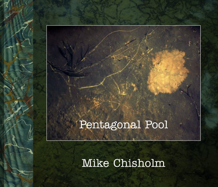
I have now received my two copies of the "layflat", revised edition of Pentagonal Pool, and it is a very attractive object indeed: truly a thing of beauty, sturdily made and very nicely printed. Using it is an unusually immersive experience: to look at pictures spread across two adjacent, rigid 10" x 8" pages is very different from looking at them on the usual curved surfaces with an acute "gutter" in between and, even if I say so myself, these particular photographs do look very good presented this way. What a shame it has to be quite so expensive (although, to my amazement, one very discriminating reader in Houston, Texas has actually bought a copy: thanks!). I have to say, they also arrived individually packaged in a totally unnecessary clamshell "gift box", which I suppose reveals something of Blurb's intended customer-base for these things: wedding albums, retirement gifts, client presentations, and the like.

So, if I've been quiet for a few days it's because I've been busy. For a long time I've wanted to make some sort of "best of" book of these written posts, but the sheer scale of the task – both in editorial time and publishing expense – has always been too daunting, which is why I made those Idiotic Hat Annual CDs: it was far simpler to create a set of PDFs containing everything than to boil down the nearly 2000 posts I have published since 2008. A classic instance of Pascal's apology for sending such a long letter, having lacked the time to make it shorter. But it occurred to me recently that a series of small, cheap selections might actually be preferable to yet another lavish production that no-one can afford.

The key to this, I realised, would be to drop all or most of the pictures, and to use Blurb's inexpensive "trade" book format, printed on their cheapest "B&W only" paper. That way, even a fairly substantial little book of around 140 pages could come in at under £5. Any remaining pictures would look pretty awful, but that wouldn't matter. It surprised me, once I started to look, how many written posts could stand alone, stripped of their illustrative matter, and lightly edited to remove any direct references to the accompanying photographs, as well as to links to other posts and external material on the Web.

The idea of making thematic selections was the other key. It's a general rule in life that 80% of anything is rubbish, and blogs are no exception. Of the 2000 or so posts in this blog there are probably 400 that warrant stand-alone publication, plus some borderline cases that have a certain amusement or novelty value. Let's say 500, which is still quite a lot, given that a typical post would occupy about 1½ pages in print; moreover, deciding which posts qualify would remain a major undertaking. But, once you apply a thematic filter, everything falls into place quite quickly. You start out looking for caprines, which is a far simpler, if tedious task, and then you sort your little herd into sheep and goats.

My first thematic thoughts were things like music, my home town of Stevenage, and, oh, the meaning of life, the universe, and everything: subjects I've returned to repeatedly over these years. Repeatedly and, it has to be said, somewhat repetitively. You can be forgiven for, in effect, rewriting the same post every few years – perspectives change, new information comes to light – but when such posts are collated into a single sequence, a certain amount of further selectivity becomes necessary: not just sheep, but the prettiest sheep.

For now, anyway, I have decided to avoid any photographic topics, for the obvious reason that more actual photographs might be required, raising the cost of production. I want these books to be cheap. The first (music, probably) is not ready yet – I want them to be good, too – but shouldn't take too long. However, as the saying, goes: cheap, good, and fast – pick any two. To keep the cost down even further, I'll probably buy copies in bulk (as many as, like, ten copies!) and distribute them myself. Which, if past experience is any guide, will probably amount to giving them away.

So that's what I've been up to: how about you? I've been surprised by the absence of comments during this period of enforced leisure. I do hope you're not enslaved to interior decoration, confined to bed, or, ah, worse. Or maybe you, too, have been happily busy in the Cave of Making?

Saturday, 11 April 2020

Easter Snow


The forecast is that it's likely to nudge, if not exceed 25° C (77° F) here on the south coast of England over the Easter weekend, before chilling off dramatically by Monday. My memories of previous Easter breaks are coloured by this typical variability in the weather, which is compounded by the fact that Easter is a "moveable feast": that is, one not falling on a fixed calendar date. In fact (pay attention at the back) Easter is very moveable indeed: it is celebrated on the first Sunday after the full moon after the vernal equinox, the so-called "Paschal full moon", which this year was also a "super moon" on 8th April, but which last year fell on 19th April, and can be as early as 21st March (but never earlier: the spring equinox being fixed, ecclesiastically-speaking, on 21st March). But, don't ask me why, it's complicated. Let's just say it's a cross-cultural mashup of astronomy, religious observance, and the fulfilment of certain Old Testament prophesies, all seasoned with a strong flavouring of calendrical inexactitude.

Add to this the fact that we have spent the last forty Easter breaks in mid-Wales, and the innate variability of weather and timing gets further complicated by geography. In hill country in spring you can expect any combination of snow, rain, fog, and solar radiation strong enough to give you sunburn: it's just part of the package at lambing time, often all within the same day. This particular set of photographs were taken in 2013, when Easter Sunday fell on 31st March, the best part of two weeks earlier than this year. It had snowed quite heavily the week before we arrived, and remained "deep and crisp and even" in sheltered pockets, despite strong sunshine. This was a relatively light dusting, however: in a previous year a post van had become stuck in a massive drift blocking the lane just beyond our rented barn-conversion, the postie having foolishly decided to ram his way through.

I don't think there'll be snow in Wales this coming week, where we would have been were it not for you-know-what, but you can never be sure. Although I can be pretty confident in predicting there won't be any here in Southampton, way down south and a mere 80 feet or so above sea-level. We haven't even had any winter to speak of this year: I think I scraped frost off the car windscreen twice. Looking at the forecast, I may yet have to break out the shorts and sandals.


Thursday, 9 April 2020

The Windows of Eden


Before the Pentagonal Pool, there was the university's Valley Garden. On the same backup drive where I recently found the original "Dry Light" exhibition files I also found a directory I had called "Glass & Ice" which, among other glassy and icy subjects, contains about 100 photographs I'd taken in the early years of this century in and around the semi-derelict glasshouses in the Valley Garden.

I have described this little Eden before, and my eventual expulsion from it, and this is also not the first time I've rediscovered the photographs taken in there: some kind of "Garden" project has always been on the cards, although it has somehow proved elusive. This cache is a true goldmine, however, because it gathers together photographs that explore a single aspect: the sheer visual pleasure of neglected panes of glass as a 2D surface, whether cracked, covered in condensation, or veiling the mysteries that lie beyond. These may yet be the key that finally unlocks that much-postponed "Garden" book.


Now, anyone who follows photography will be aware what a cliché this has become. Fay Godwin's wonderful little book Glassworks & Secret Lives (Stella Press, 1998) consolidated the genre, along with John Blakemore's rather more claustrophobic still lifes in Inscape (Zelda Cheatle, 1991) and The Stilled Gaze (Zelda Cheatle, 1994), and in its own way Keith Arnatt's Rubbish and Recollections (Oriel Mostyn, 1989) defined a relevant visual language. Of course, in those essentially pre-Web days, one didn't really know what was going on in the wider world, except by stumbling across books or features in magazines. I'll never forget walking up London's Charing Cross Road in 1998 and being stopped in my tracks by the limited edition hardback of Glassworks & Secret Lives on display in the shop window of Shipley's Art Bookshop. On going inside and opening a copy, I'm pretty sure I exclaimed FUCK!! on seeing the pictures inside: I had been convinced I was working a highly original vein of imagery. Than which, of course, no greater illusion exists in the world of photography: someone, somewhere, has already done everything. Everything. Not necessarily better, though, and definitely not through your eyes: originality of subject matter is never really the point.

So, never mind: these are still satisfying photographs in their own right with which, for whatever reasons, I failed to do anything at the time, but which still possess whatever longer-term merits they had then.  All of them were taken using either an Olympus C5050 (5MP compact) or a Canon EOS 350D (8MP DSLR), and I am impressed by the quality of those 8MP Canon files, in particular. They may only be printable to A4 size at a native 300 dpi, but they are beautifully soft and clean – virtually no "noise" at all – with that subtle Canon colour fidelity I had forgotten about. Of course, the intervening 15 years of experience in processing digital images means I have been able to make a far better job of making pictures out of them, too. Maybe their time has finally come.


Tuesday, 7 April 2020

Never Say Never: UPDATE

Sorry, I hadn't realised I had to make the Blurb book publicly available in both versions, in order for the link to the preview to work. Now corrected!

Monday, 6 April 2020

Never Say Never


Pentagonal Pool run dry

I had pretty much convinced myself that I wouldn't use Blurb's "layflat" book format again, much as I like it. It's very expensive, and – as I discovered last time – the books are actually made in the USA, despite being created via Blurb UK, and therefore incur an import tax on arrival. Ouch! But then recently I found a cache of the original files I'd made for an exhibition in 2004-5, Dry Light, which mainly made use of the digital images I'd been taking at the tail end of the project that had occupied my daily lunch hours back in my days of wage-slavery, photographing what I had dubbed the "pentagonal pool" on the Southampton University campus.

The idea behind these files was that, in order to compensate for the small maximum printable size of these digital files (mainly from a 3MB camera), I would arrange them in long panels of multiple images, which could usefully exploit the patterns and variations that arise when a single but extremely variable subject is photographed repetitively over a long period of time. To this end I created a number of large single files combining three or four photographs, which could be printed for framing on the "panoramic" paper that Epson used to sell (essentially an A2 sheet cut in half lengthways). I thought these files had gone missing long ago, but found them hiding in a sub-directory on a backup drive, and was pleasantly surprised by their quality.

I then remembered that the problem, from a book-production point of view, had been that at the time Blurb's ready-made page layouts could not accommodate a single file laid across a double-spread of pages. The only workaround was to put two horizontal pairs on facing pages, but this gave a quite different impression to the original idea and, worse, there was no way to make use of the groups of three: the central image would at best have to be cut in half and would anyway be hopelessly distorted by the "gutter" between the pages. So the original Pentagonal Pool book of 2006 was, in one sense, a triumph of creativity over adversity but also, it has to be said, a bit of a travesty of my original intention.

Having rediscovered the original exhibition files, though, my immediate thought was that these would be perfect for a "layflat" book. Which they are, and here it is:
Now, you know and I know that no-one is ever likely to buy a copy of this book [1] – it would cost them £60, after all, plus any import tax for non-US customers – so I'm not going to make it publicly available, except as a PDF for £4.99. However, if any reader of this blog does want to buy a copy, by all means send me an email (my address is in the "View My Complete Profile" section at top right) and then I'll either pass on a link so you can buy one directly, or we can wait until Blurb's next 40% off! sale, and I'll buy a copy on your behalf for them to despatch to you.

Pentagonal Pool brimful

1. I do generally buy at least two copies of my own books: one for me, and the other for deposit in my old college library, which has been in continuous operation since 1263 and unlikely to be going out of business any time soon.

Saturday, 4 April 2020

Coincidence Be My Guide


Wrinkly Brautigan, ca. 1971
(hey, nobody told me you needed to stretch the paper...)

When it comes to cultural matters, I'm very susceptible to being led by coincidence. This is not as irrational as it sounds: there's a huge difference between, say, coming across two or more references in a matter of days to the same painting or painter, previously unknown to you, and the sort of uncanny coincidences that prickle the antennae of deluded seekers after signs and portents. For one thing, the former are the result of real human activity: they're straws in the wind, a buzz, a signal that something of possible interest to you is stirring in the contemporary world. The latter are, well, just coincidences.

Obviously, when you are young, pretty much everything is new and unknown to you, and the busy criss-crossing of tracks means the world is thick with meaningful coincidences. I remember how, aged 17 in 1971, the placename "Big Sur" meant absolutely nothing whatsoever to me, but then I read Richard Brautigan's story A Confederate General From Big Sur (does anyone read him any more?), and I immediately started coming across references to Big Sur everywhere: as a novel by Jack Kerouac (does anyone read him any more?), as the home of numerous bohemian notables of the 40s and 50s, as the haunt of photographers like Edward Weston, as the location of the Esalen community, and so on.

Such positively-charged noticings are not so much coincidences, strictly speaking, as a curious mind flagging up a new bit of data as possibly related to a previous bit of data: they are experienced as coincidence because you lack any context that would explain the relationship. It is not accidental, after all, that Big Sur turns up in the contexts it does, but I had no way of knowing this. And, until I had read the Brautigan book, I was not primed to notice it. Cultural and social moments and movements always have certain people, places, and things that act as common denominators, many of which are no more than the arbitrary specks of dust around which the crystal can form. But if a moment or movement achieves even a temporary degree of media saturation – perhaps through reviews of a recent book, or an exhibition, or even an obituary – quite often it's precisely these random elements that you notice first, vividly experienced as apparently unconnected coincidences. How many mentions, for example, did it take before you first realised the multifaceted significance of New York's Chelsea Hotel, LA's Laurel Canyon, or the place of St. Ives in British art history?

Now that I'm older, after a further 50 years of education and experience, it takes rather more to get my attention, but it still happens: after all, ignorance is a lifelong condition. For example, looking on Amazon Prime recently for something low-key but entertaining to watch, I settled on Tobago 1677, a documentary about undersea archaeology, and the 17th-century struggle between the French and the Dutch for control of this tiny foothold of empire in the Caribbean. It wasn't a great programme, thin on actual archaeological results and overlong, but was quite informative about the events and personalities leading up to one of those historical events that (I presume, in my ignorance) no-one but specialists will have heard of, the Battle of Tobago. In the well-established style of such documentaries, a lot of the footage is made up of what used to be called "rostrum camera" work, but is now generally known as the "Ken Burns effect": the use of camera movement, voice-over, and music to enliven and add narrative force to static contemporary visual documents like engravings, portraits, and photographs.

One of the key players on the Dutch side in Tobago was someone apparently called commodore Jacob Benckez, or perhaps Bénquez – it sounded like an odd name for a Dutchman – who was a bit of an action man in that swaggering age of seafaring action men. So, naturally, his portrait played a leading role in the Ken Burns manner, the camera slowly zooming in on a pair of slightly worried-looking eyes (voiceover: "Benckez was a unusual man..."). As so often, the portrait was unattributed: just another sombre Dutch oil painting from the stock library. But then a few days later I was reading the latest copy of the TLS, in which there is a review by Ferdinand Mount of a current exhibition in the National Gallery (temporarily closed, sadly, like everything else), "Nicolaes Maes: Dutch Master of the Golden Age". In it I read, "... the naval trophies carved and gilded in the frame of the portrait of Jacob Binckes, a naval officer who was killed with half his garrison when a cannonball blew up the powder magazine during a French attack on the Dutch colony of Tobago". Whoa, hang on... That there Binks must be "Benkez" from Tobago 1677... Coincidence! Not to mention connection, correction, and redirection.

Then I went on to read a piece by Simon Schama in the same issue: a reprinted review of a 1992 exhibition, "Rembrandt: the master and his Workshop", in which he comments disparagingly on a portrait by Maes (pronounced "Mars" apparently – Dutch pronunciation is a minefield) of arms magnate Jacob Trip (Tripe? Dreeb?) which was once attributed to Rembrandt; at which point the nudging started to feel more like a solid push. But to where, exactly? Maes? Binckes? Rembrandt? Golden Age portraiture? Tobago? Exploding powder magazines? I'm happy to wait for the next coincidental shove to find out.

It goes without saying that I'm no scholar, and, much as I love art, I'm no art historian, either. All these names, dates, places, events, and the links between them may well be commonplaces to the Schamas and Mounts of this world, but not to me. I'm perpetually at the stage where new discoveries are best made not by diligent study, but by following the buzz of "coincidence". Which is why I like to let such coincidences be my native guide through the vast territories of my ignorance; if it's not exactly the aleatory method of The Dice Man, it's also very far indeed from the painstaking methods of scholarship, and a lot more fun. And, simply by chance – by coincidence, by serendipitous connection – I can now point out to Mr. Mount that the fateful powder magazine on Tobago was in fact not exploded by a cannonball but by a mortar shell that ignited a gunpowder trail dropped by a panicky powder monkey which led, inevitably, back to the magazine. I know it's true, I saw it on TV.

"As above, so below": passing portent at St. Audrie's Bay, Somerset
(Fuji GS645S on Jem Southam workshop, 1995)

Wednesday, 1 April 2020

Hiraeth


Because of the restrictions on travel, this year – for what I think is the first time in 40 years – we won't be going to Mid-Wales at Easter. Which is particularly annoying, as for the first time in several years we had managed to book our favourite accommodation, a large, comfortable barn-conversion on the top of a hill near Penybont. It goes by the name of Hiraeth, which is one of those Welsh words that seems to have no direct equivalent in English, but lies somewhere in the region of "homesickness", "nostalgia", "longing", and "regret", that heady brew of mixed feelings exiles have for a homeland lost in time and space: you get the picture. So, as a name it seems very appropriate at the moment, even though I don't have any Welsh ancestors [1]: like your elective family, it seems you can adopt a new Heimat.


Hiraeth the ex-barn is ideally placed to experience and photograph the full range of landscapes in the area. Not least because, being perched high on one side of a SW-NE oriented valley with a handy balcony outside the bedroom, you get to see the sort of scenic sunrises and sunsets usually the preserve of the hard men of landscape photography, with their bivouac bags and thermal underwear, and go back to bed afterwards with a cup of tea. It is also nicely situated between the cultivated valleys around Llandrindod Wells down below and the austere uplands of the Radnor Forest up behind, as well as within a comfortable drive of a number of attractive destinations either side of the border, not to mention at least one Michelin-starred restaurant.

But not this year. Or at least not, as is our tradition, at Easter, when the farms are loud with all-night lambing sheds, the long-distance ramblers are out on the Offa's Dyke Path, and there could be snow or there could be sunshine, depending on the mood of the weather. So, instead, I'll continue to raid the landscape backfiles and put up some galleries of Radnorshire [2] scenics, perhaps even including some of the truly nuclear sunsets I have watched going down beyond the far side of the valley.


1. AFAIK. My maternal great grandfather is unknown, but must have been in Liverpool around March 1896, so not impossible.
2. Technically, Radnorshire no longer exists, having been subsumed into the mega-county of Powys around the time we started visiting but, like the Ridings of Yorkshire, it continues an outlaw existence as a necessary geographic and cultural category.

NOTE: I have now received a paper copy of Byrne and Swinton's Guide to Edinburgh, and it is good to go, so I've made it available for purchase. I know how much you'd be waiting to hear that!